Fred’s search card · live
Find me a 1 bed in Williamsburg, Greenpoint or the East Village under $4,500
Apartment search
Done- Searching listings1,214
- Reviewing matches
- Picking the best
$3,350 · Greenpoint
1 bed, 1 bath · $950 under the area’s usual
$3,900 · Greenpoint
2 bed, 1 bath · 4 min to the G at Greenpoint Av
$4,750 · East Village
1 bed, 1 bath · 9 min to the F · Washer/dryer in unit
Fred • 2026
An AI agent that hunts apartments in New York
Overview
Fred is an apartment-hunting agent for New York. You tell Fred what you want, and it searches the listing sites for you, checks each building against city data and keeps likely scams out of your inbox.
James Darby and I built it in one day at the AI Engineer NYC hackathon. I did the research, the product design and the web app, and James built the backend and Fred himself. It’s live, and you can try the demo without an account.
- Role
- Research, product design and frontend
- Team
- Me and James Darby
- Timeline
- 1 day, October 11, 2026
- Built with
- Next.js, Tailwind CSS, Vercel AI SDK, MapLibre
Problem
How might an AI agent find you an apartment without becoming one more thing you can’t trust?
James and I are apartment hunting in New York right now, and it’s really a full-time job. Zillow, Apartments.com and Zumper all launched AI chat search in the last two years, so another chatbot wasn’t the answer. Jack & Jill, an AI agent for job hunting, turns a search into a conversation with an agent and an inbox of matches, and I wanted that for renting.
A New York apartment hunt has 4 problems a design has to handle:
Every site is its own hunt
Each one has its own alerts, and the same apartment shows up on several of them.
The real cost is hidden
You find out about the broker fee and the monthly fees after you’ve fallen for a place.
The building is a mystery
Violations, heat complaints and bedbugs are public records, but few renters look them up before a tour.
Scams look like deals
A place well under the area’s usual rent is either a great find or someone asking for a deposit before you see it.
Goal
Build something James and I would trust with our own hunt, in one day.
What it had to do
Only put places in the inbox that fit what we asked for, and back every number with the listing or city data.
Research
Renters didn’t need it faster. They needed to trust it.
Before drawing anything I pulled 8,205 App Store reviews from 31 rental, roommate and touring apps and sorted the 1 and 2 star ones by what went wrong. I expected speed to top the list, since good apartments here go in days, and it barely showed up.
What 4,190 one and two star reviews were about
- App bugs, crashes and login26%
- Scams or fake listings12%
- Search ignores my criteria11%
- Paywalls and billing10%
- Touring and scheduling6%
- Landlords never respond5%
- Stale or already rented3%
- Alerts arrive too slowly0.5%
- The share of the 4,190 one and two star reviews that complain about alerts arriving too slowly.
- 0.5%
- The share of the 4,190 one and two star reviews about scams or fake listings. It rises to 15% in the last two years.
- 12%
- Reviews from 2026 that mention AI and gave the app 1 or 2 stars.
- 56 of 72
Scams and ignored criteria were the real pain.
Scams were 12% of bad reviews, and search that ignores what you asked for was another 11%. The usual scam is an out-of-state “landlord” who wants a deposit by Zelle before anyone sees the place.
AI was a liability.
56 of the 72 reviews from 2026 that mention AI gave 1 or 2 stars. People hated AI that was pushy and hard to turn off, and praised AI that kept an eye out for them quietly.
Speed wasn’t the complaint. Wrong alerts were.
Slow alerts were 0.5% of bad reviews. Renters complained about alerts that ignored their criteria or pointed to places that were already gone.
Renters asked for proof.
Their feature requests included building and landlord reviews, verification, a way to hide a whole building and comparing saved places side by side.
What it meant for the design
So the brief changed. Fred had to earn trust and stick to your criteria, and do it quietly, instead of racing to be first or chatting at you. I wrote that down as 4 rules.
Quiet by default
Fred’s thinking is one line, and it speaks up when something matches.
Your criteria are rules
A dealbreaker stays a dealbreaker, and places that clearly miss one never reach your inbox.
Every number comes from the data
When a listing doesn’t say, Fred says Unknown and why, instead of guessing.
Nothing goes out without you
Fred drafts the email to a leasing office, and it only sends after you approve it.
Ideation
Is Fred a character?
I mocked up three directions before building anything, and each one answered that question differently.
- Direction A
Doorman
Fred is the doorman who knows every building: a warm character with a serif, deep green and brass.
Morning. One of these is worth getting up early for.
- Kept:
- “Why this one” on every listing
- Left:
- The serif and brass, and a doorman works for the building, not for you
- Direction B
Express
Fred talks like a good subway announcement: a clipped voice, signage type and an orange F.
1 strong match. Listed 18 min ago. Tour it tomorrow.
- Kept:
- The short, plain voice
- Left:
- The orange F, and it sold speed, which renters didn’t ask for
- Direction C
Markup
Fred is just a name, and a highlighter marks the fine print for you.
Fred found 1 strong match among 212 new listings.
- Kept:
- The restraint, and Geist
- Left:
- The highlighter, which got busy fast
None of them felt right on its own. The layout I kept coming back to was Jack & Jill’s: a sidebar, a chat and an inbox of matches on a quiet near-white page with black buttons. So I built Fred in that shape and brought back the best part of each direction. I didn’t borrow their line-drawn faces, colors or typeface, so Fred needed a mark of its own.
Design decisions
Quiet, precise and honest about what it doesn’t know.
A window instead of a face
Fred’s mark is a portrait window, a box with a cross drawn in a 1.25px line. While Fred works, the four panes light up yellow one at a time, and they go dark when it’s done. Yellow has no other job in the app, so when you see it, Fred is on it.
The mark · live
Sidebar · 20 × 26
FredIn the chat · 13 × 17
Watching for new places…Thinking in one line, not a log
My first version showed Fred’s work as a card with a checklist, and it was way too much to read while you wait. Now it’s one line. While Fred works it says what it’s doing next to the lit mark, and when it’s done it folds into a short summary you can open. When Fred asks you something, the answers come as buttons you can tap.
Fred’s thinking · before and after
First version
Does 292 Nassau take dogs?
Checked 212 new listings since 7:00 AM
- Merged 31 duplicates across sites
- Skipped 2 likely scams. Both wanted a Zelle deposit before a showing.
- Checked pet policy and laundry on 14
- Asking 2 landlords about dogs…
What shipped
Does 292 Nassau take dogs?
2 stepsThe listing says pets are case by case, so I’d ask before you tour. Want me to write to the agent?
When Fred searches, the reply gets a card like Jack & Jill’s job search, with numbered steps and a skyline. I drew Fred’s skyline from the mark, so its windows light up yellow as Fred looks and the areas and listings it’s checking float over the city. When it’s done the lights hold where they were, and the places Fred picked show up underneath, ready to save or pass without leaving the chat. That’s the card at the top of this page, rebuilt from its code.
An inbox that reads like answers
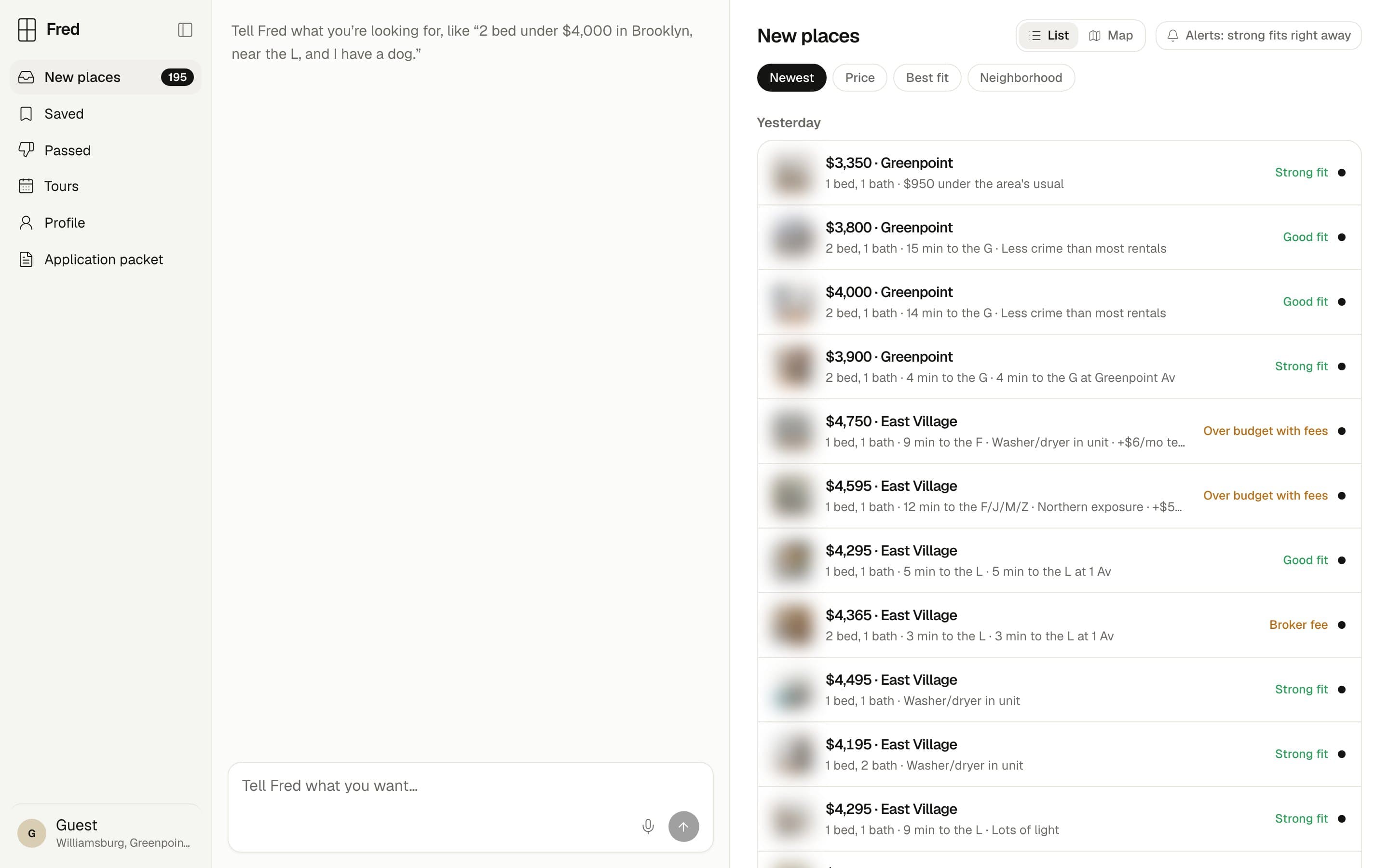
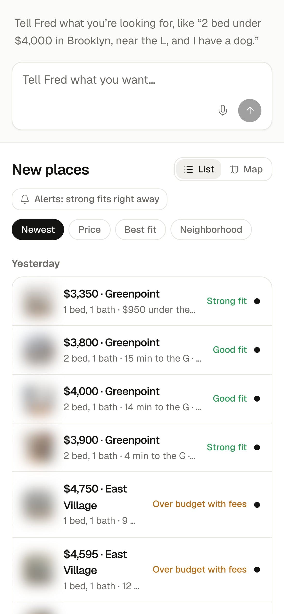
- Each place is its price and neighborhood, one line of facts and a fit word, grouped by the day Fred found it.
- Fit is always a word and never a percentage: Strong fit, Good fit, or the reason it’s a stretch, like Over budget with fees or Broker fee.
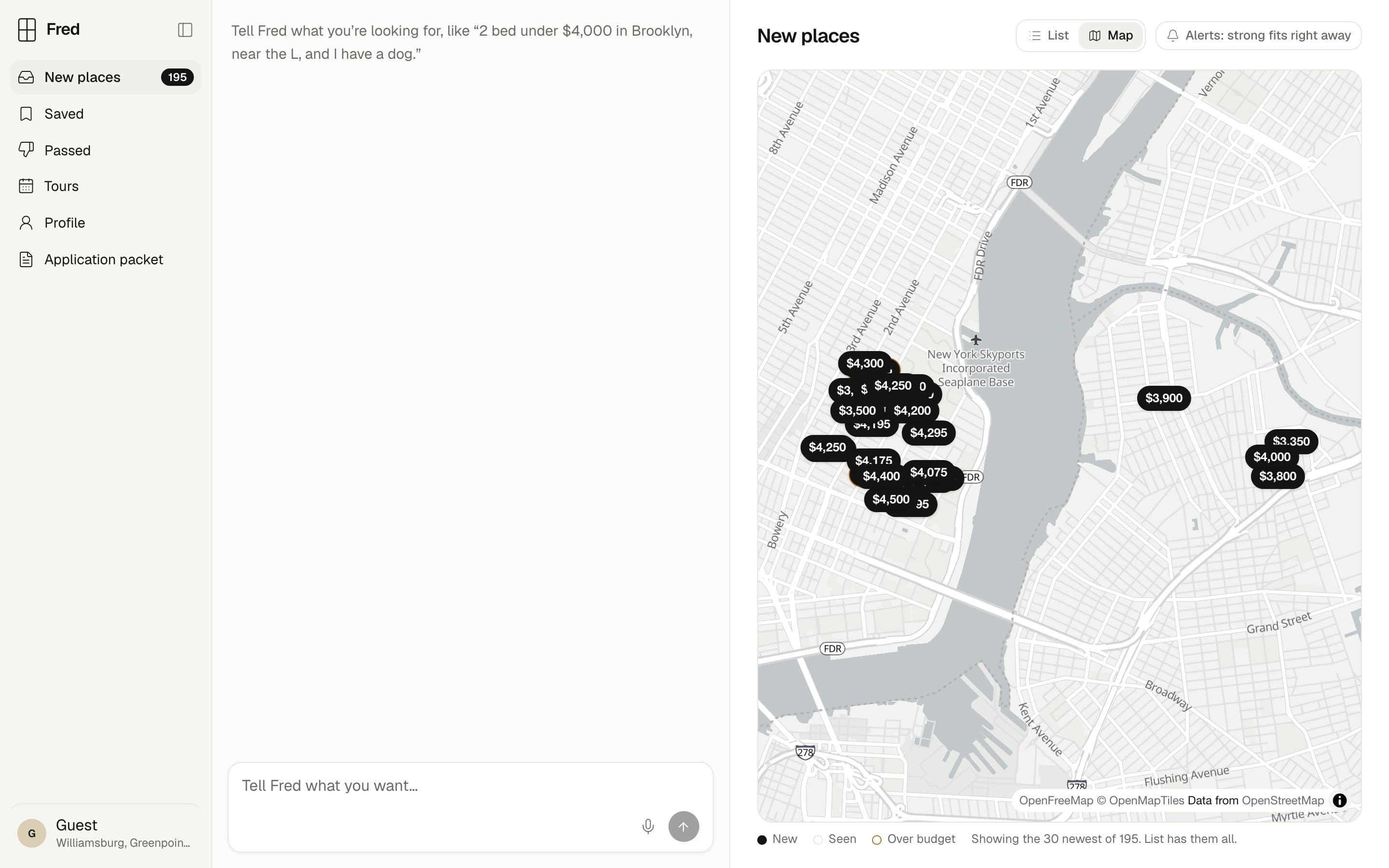
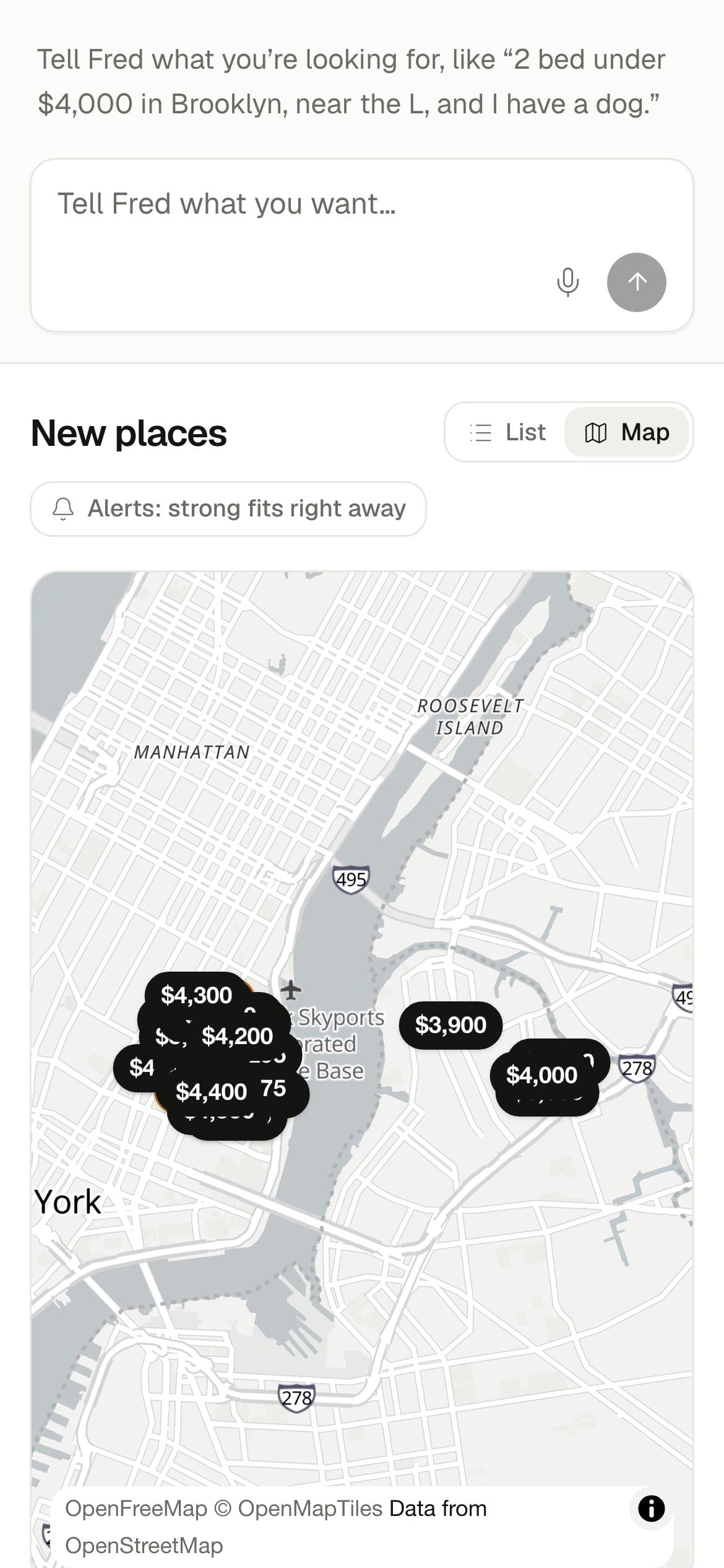
- You can sort by newest, price, best fit or neighborhood, or switch to the map, where every place is a price pill. The map frames your places once, so saving or passing one leaves it where you put it.
- You can drag the seams between the panes to give the chat more room, and the mic turns your voice into text with Whisper, right in the browser.
The facts first, and Unknown when the listing doesn’t say
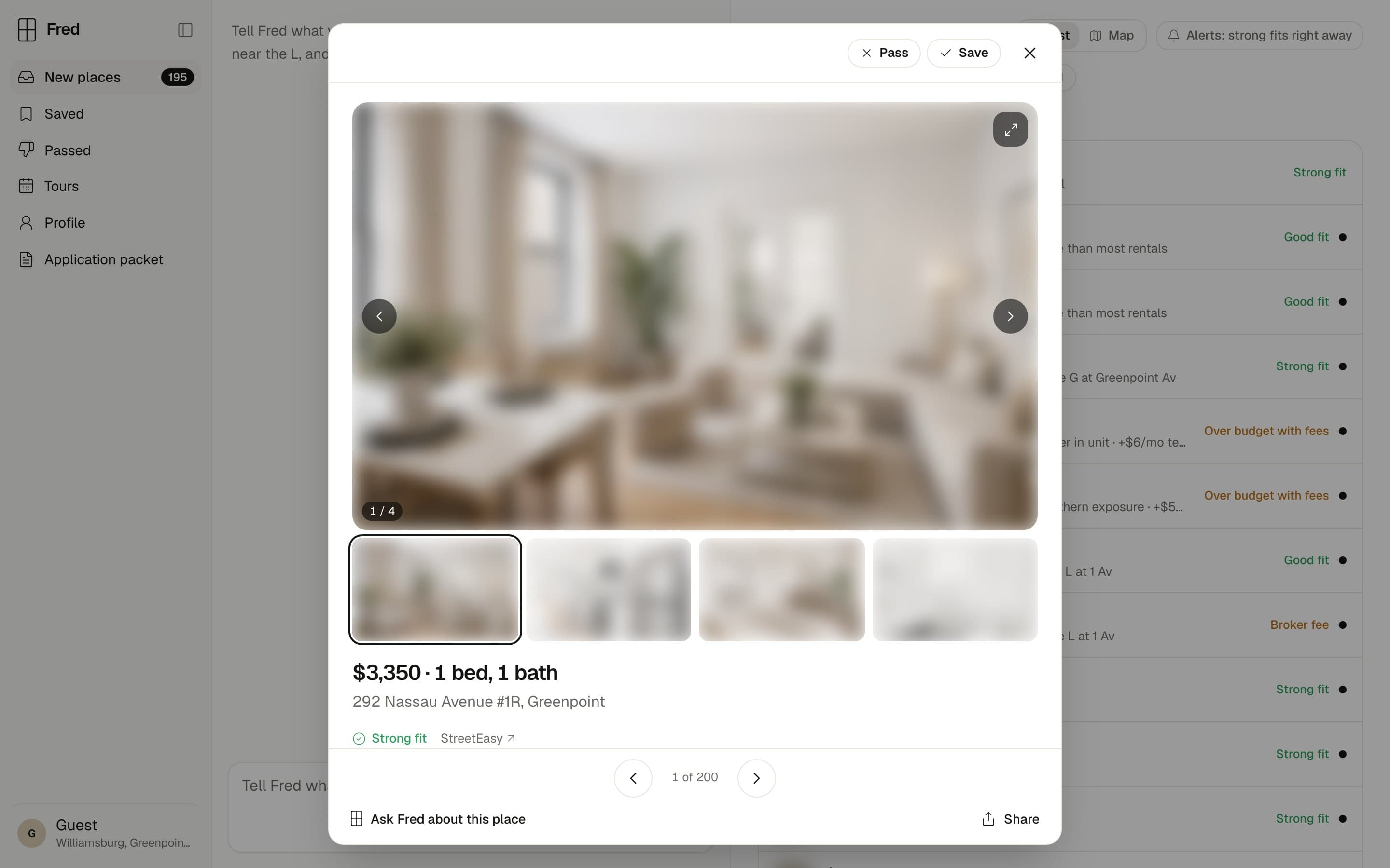
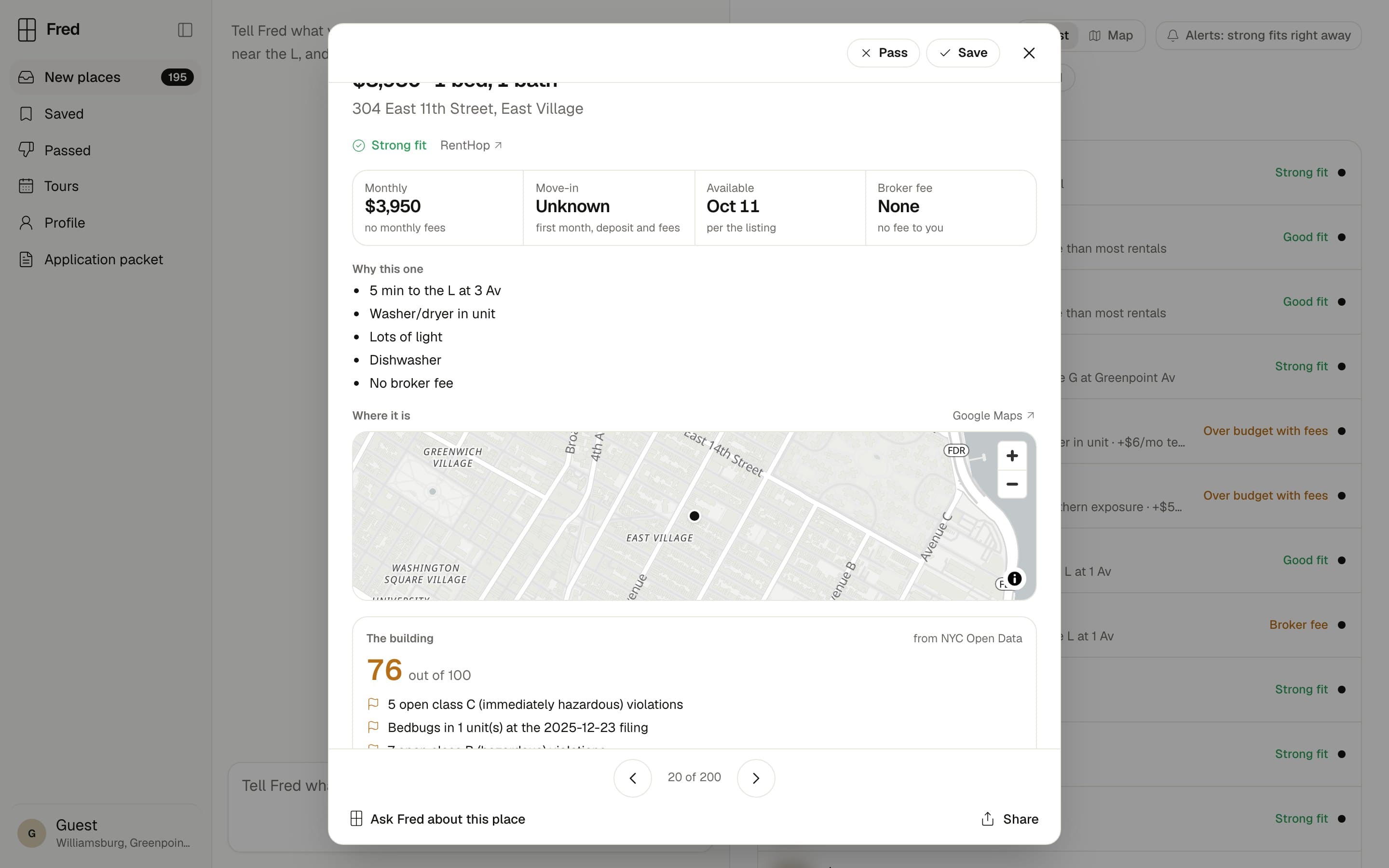
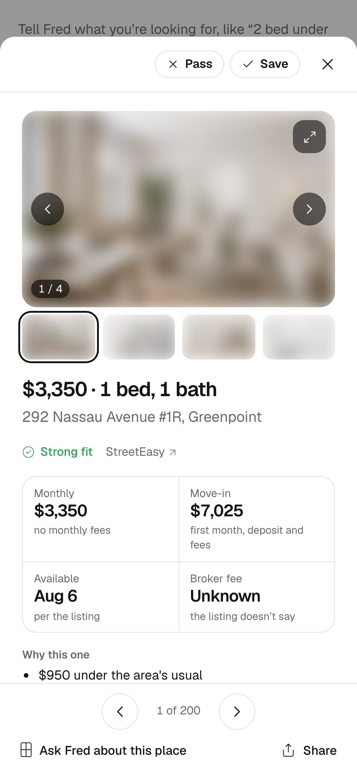
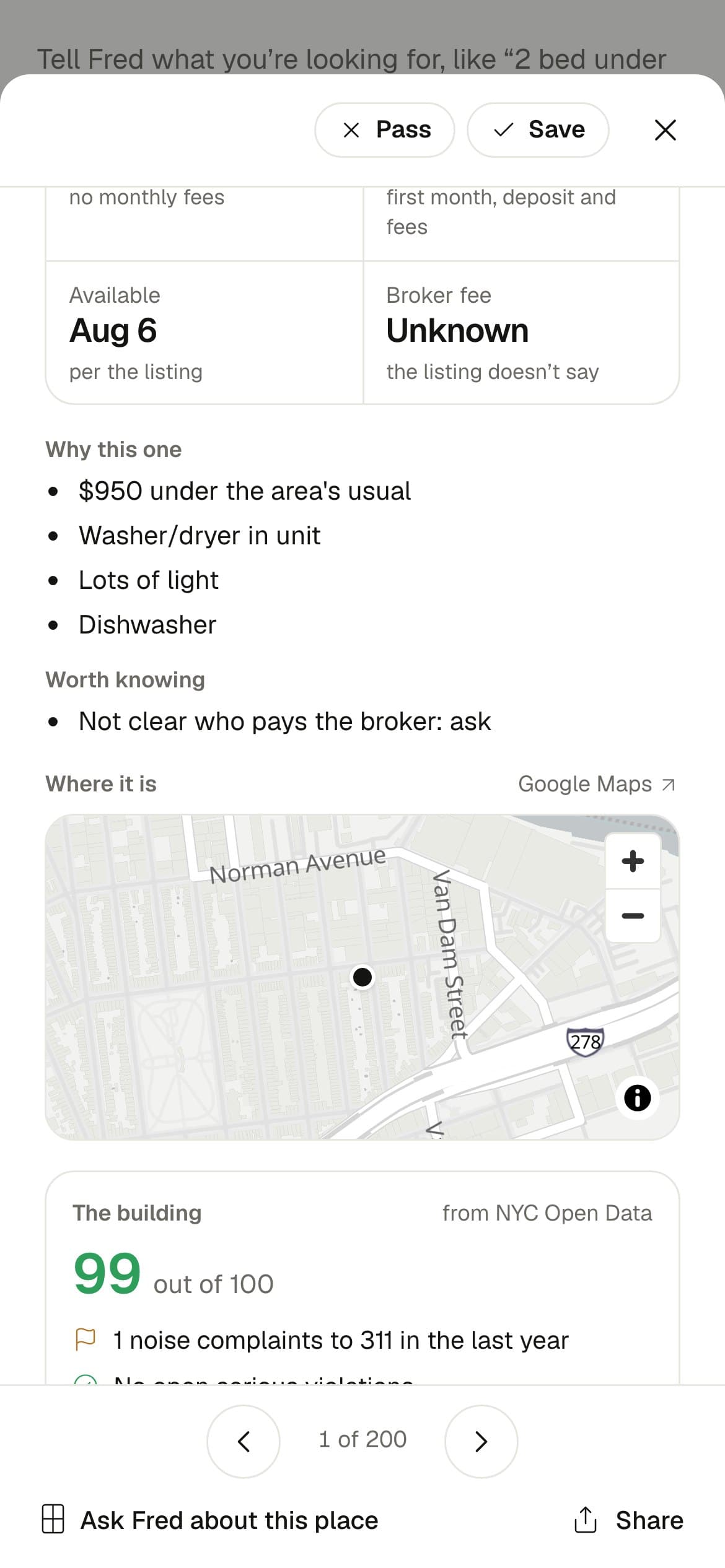
I picked a modal over a side pane so a listing gets your full attention, and each one still has its own link, so you can text it to a roommate and the back button closes it. The arrows and arrow keys step through your inbox, and the places on either side load in the background, so the next one opens right away.
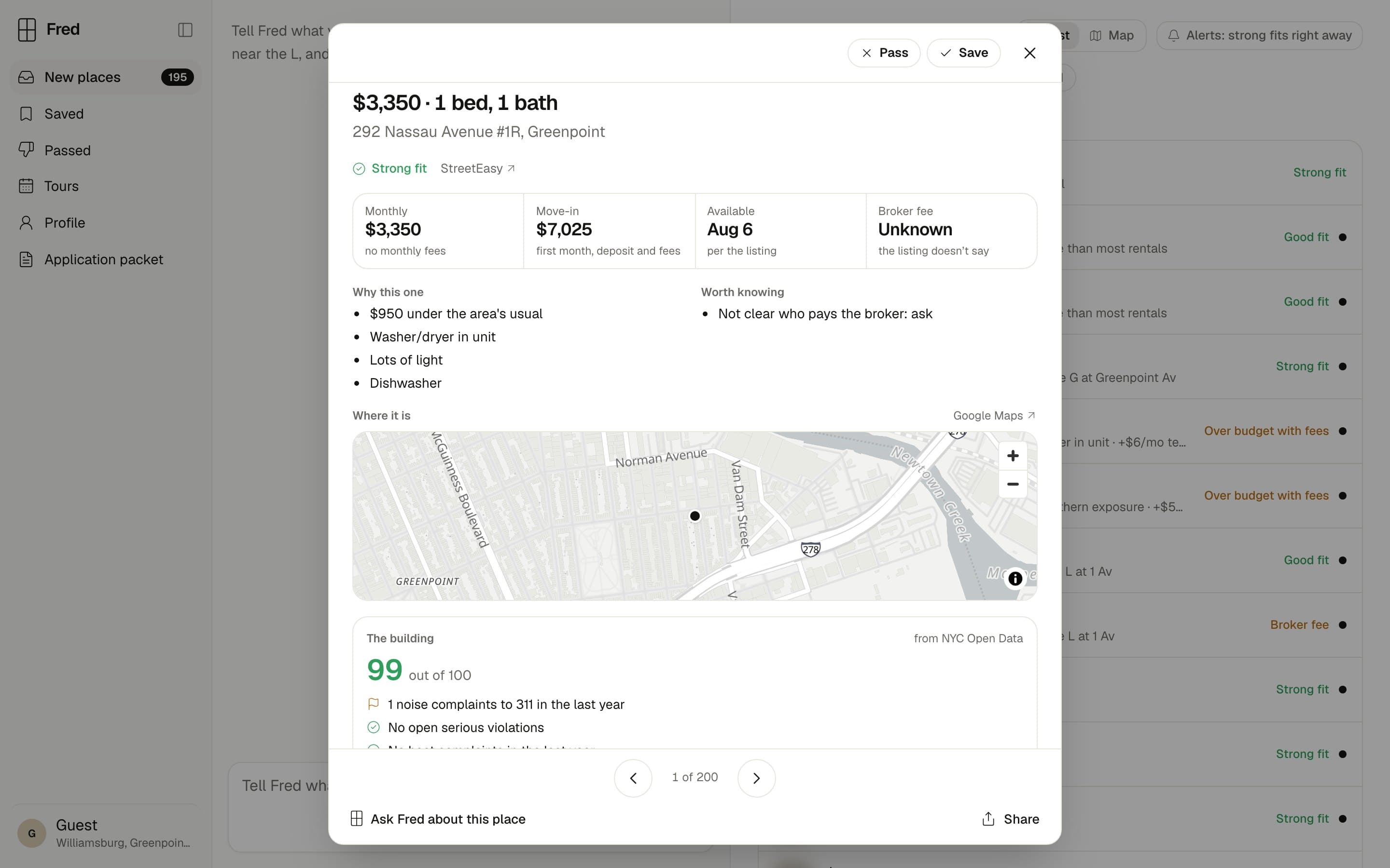
- The four facts are the monthly cost with required fees, what you’d pay to move in, when it’s available and the broker fee. If the listing doesn’t say, the box says Unknown and why.
- “Why this one” and “Worth knowing” come from Fred, like “Not clear who pays the broker: ask”.
- The mini map zooms with its buttons, a double-click or a pinch, and leaves the scroll wheel and arrow keys to the modal so it never traps you.
- Each building gets a score from NYC Open Data, built from open violations, heat complaints, pests and 311 noise.
- Passing asks what put you off, so Fred learns from it, and Undo is right there.
Dealbreakers are rules, and nuance lives in Fred’s memory
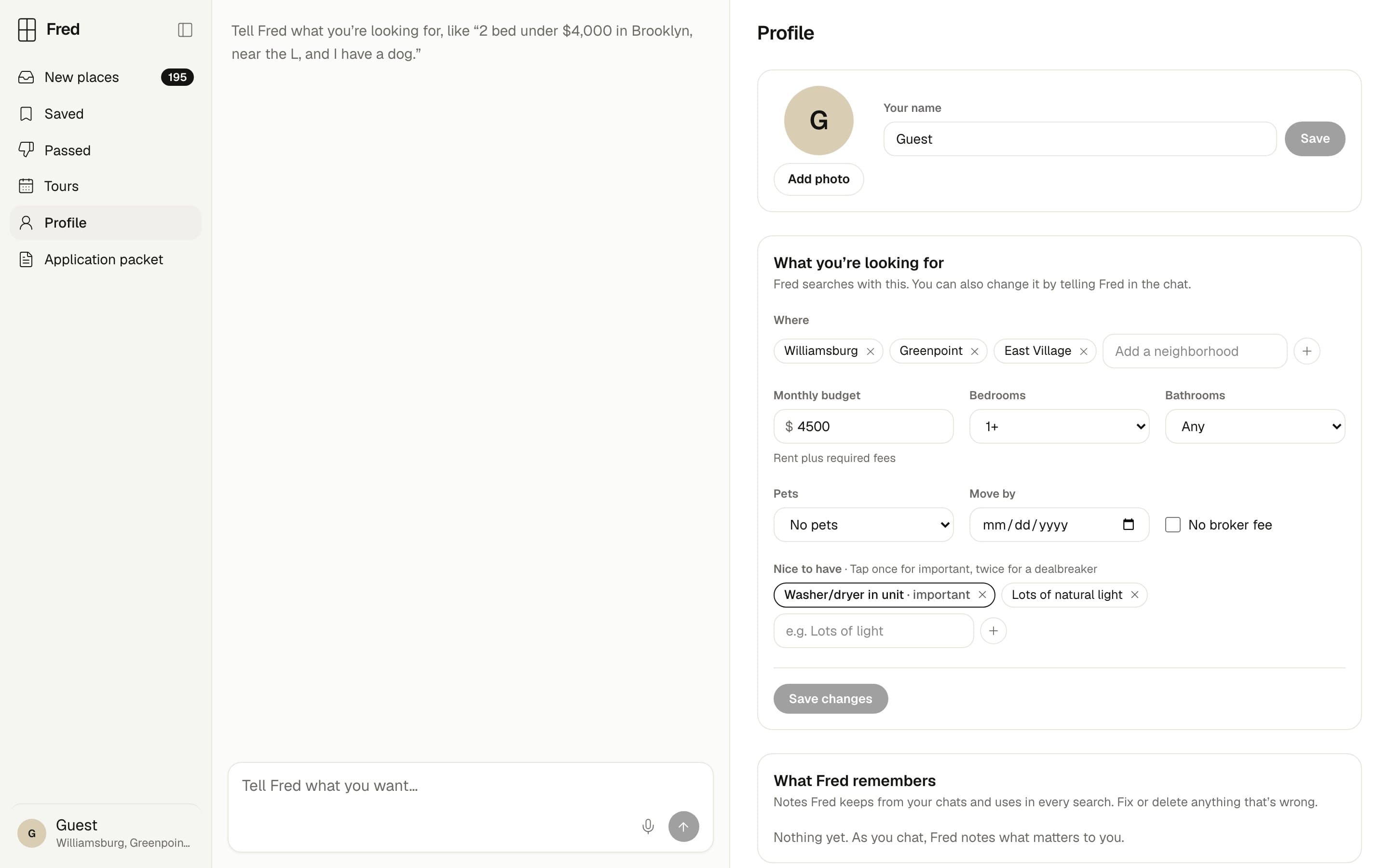
Search that ignores what you asked for was 11% of the bad reviews, almost as many as scams, so the Profile page makes the difference between must and nice clear. Hard limits like area, budget, bedrooms and pets are dealbreakers. A nice-to-have is one tap from important and two taps from a dealbreaker, and Fred sees the difference.
Nice-to-haves · tap one
Nice to have · Tap once for important, twice for a dealbreaker
What Fred remembers · example notes
What Fred remembers
Notes Fred keeps from your chats and uses in every search. Fix or delete anything that’s wrong.
Needs
Two baths ideally, one is OK
Dislikes
Walk-ups above the 3rd floor · Fred’s guess
Timing
Moving by December 1
Under the search, What Fred remembers lists the notes Fred keeps from your chats, grouped into needs, likes, dislikes, timing and about you. You can fix or forget any of them, and notes Fred worked out on its own are marked as Fred’s guess.
I tried adding “ideally 2 baths, at least 1” to the form as two controls, and the page got worse, so I took it back out. That kind of nuance is easier to say in a sentence, so it lives in Fred’s memory.
System
One set of tokens for light, dark and phones.
Every color is a token with a light and a dark value, named the way shadcn names them so components pick them up for free. The map tiles and controls switch with your system too. On a phone the chat sits on top, the inbox below it, and a listing opens full screen.
| Token | Light | Dark | Used for |
|---|---|---|---|
| Background | #FFFFFF | #121211 | The inbox, cards and the modal |
| Sidebar | #F5F5F2 | #1A1A18 | A step warmer than the inbox |
| Foreground | #141413 | #EDEDEA | Text, the send button, unread dots and the mark |
| Highlight | #FFDD55 | #F2CF45 | Lit panes and skyline windows, only while Fred works |
| Success | #2E9E5B | #4CC27E | Strong fit, Good fit and a healthy building |
| Warning | #B86E14 | #F0A050 | Over budget with fees, broker fees and building flags |
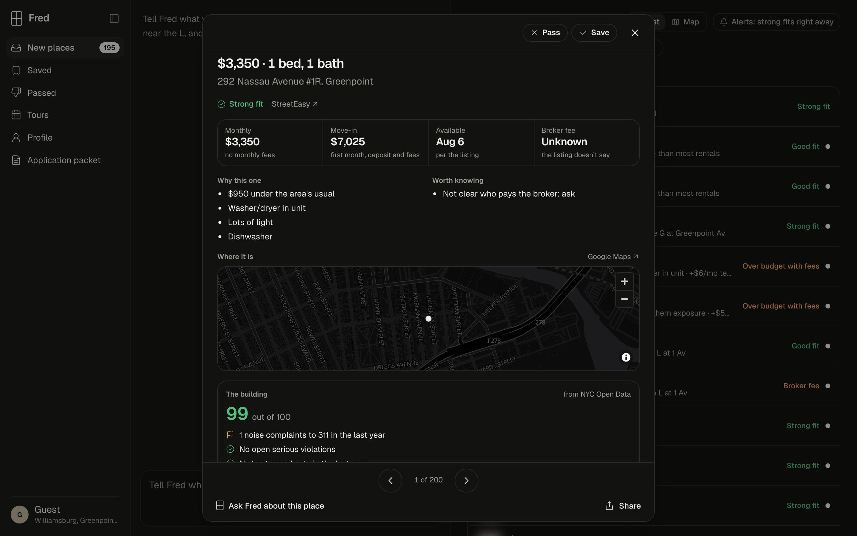
Inbox
Listing
Facts and map
Map
Results
Live, with a demo anyone can try.
Fred runs on our own domain, and the demo signs you in as a fresh guest with an example search, so you can try the real app, real listings and the real Fred without an account.
- Built in
- 1 day
- My commits to the Fred repo on October 11, 2026, not counting merges.
- 37
- Places in a new demo guest’s inbox on October 12, 2026, for 1 bed or more under $4,500 in Williamsburg, Greenpoint and the East Village.
- 195
How I built it
Next.js on Cloudflare, the Vercel AI SDK for the streaming chat and MapLibre for the maps, talking to James’s Mastra agent through one typed contract. The engineering side has the details.
Reflection
Reading reviews before designing changed what I built. I almost made Fred fast and chatty, and renters care much more about trust and a search that sticks to what they asked for.
What I’d do next:
- Give a new person a first conversation. Right now the chat starts as one line of example text, which leaves a lot of empty column.
- Design alerts properly. Email works today, and texts would reach people faster.
- Compare saved places side by side, which renters asked for in the reviews.
- Put it in front of renters who aren’t us.