Live, from OrderSync’s code


OrderSync • 2026
Making an AI ordering tool look like something you’d trust with your orders
Overview
OrderSync reads purchase orders in any format, from EDI to PDFs to plain email, and puts them straight into a company’s ERP.
I redesigned its marketing site and built the design system behind it, so every page, from the homepage to the billing screen, is visually consistent.
- The redesign shipped on June 19, 2026, as 8 pull requests.
- 8
- Files the 8 pull requests touched, from the homepage to sign-in and billing.
- 237
- Gradient classes in the site’s code, just before and just after the redesign merged on June 19, 2026.
- 155 → 6
- Places in the code that set a brand color. They now point to 3 navy values instead of loose hex codes under 4 names.
- 450 → 3
- Role
- Design engineer (contract)
- Timeline
- May 18 to June 19, 2026
- Scope
- Marketing site, design system, business cards
Problem
How might we help buyers confirm OrderSync fits, and make booking a call the easy next step?
OrderSync’s buyers already know their problem: orders arrive in every format, and someone types each one into the ERP. The homepage’s job was to confirm OrderSync fixes it, and make the call easy to book.
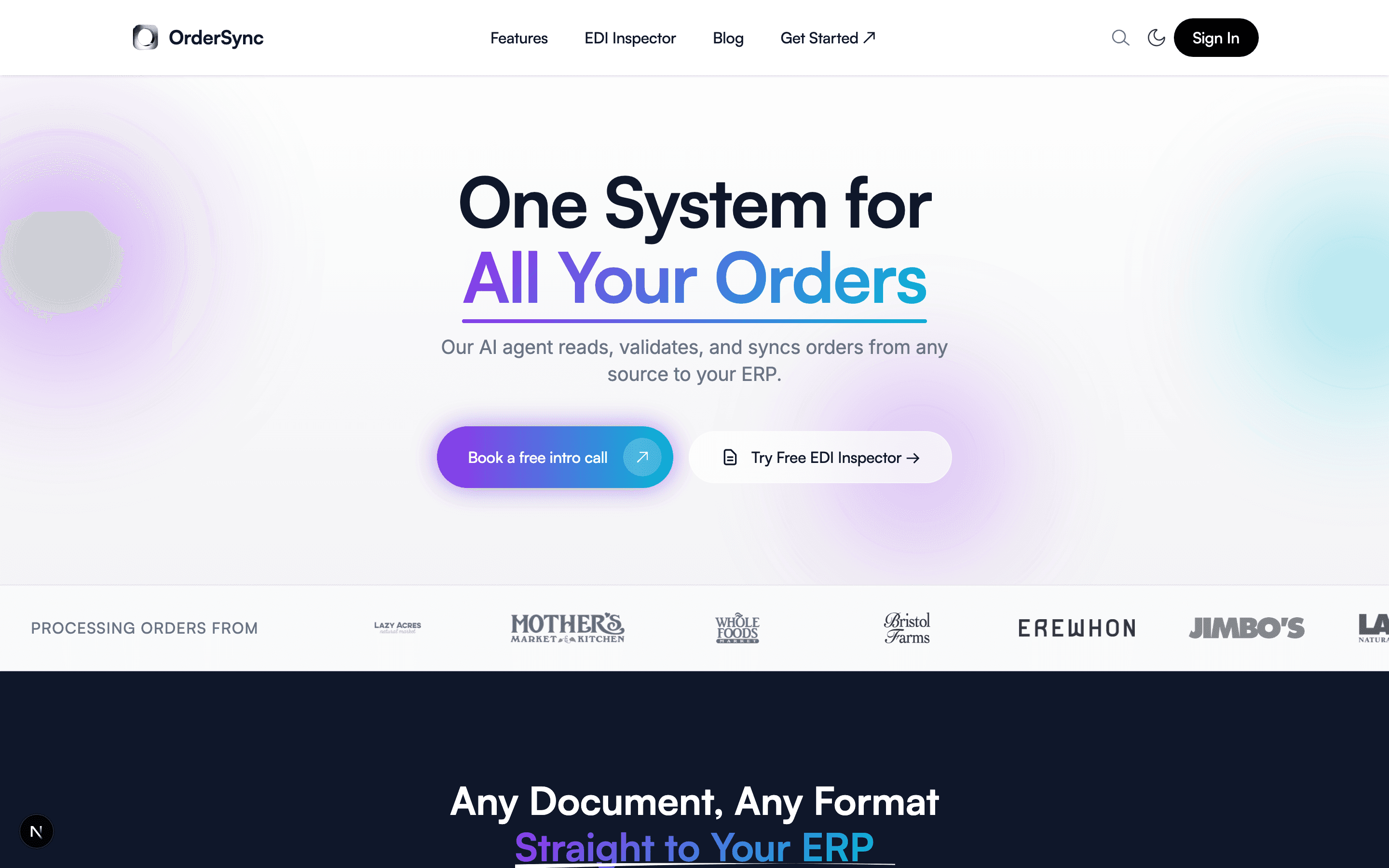
Here it is the day before the redesign started, rebuilt live from its code.







Heuristic evaluation
I ran a heuristic evaluation of the old homepage and found 5 problems, each tied to a usability principle.
A menu called Pages
Match with the real world
The free tools sat in a menu named Pages, which says nothing about what’s inside.
1 action, 2 names
Consistency and standards
Get Started in the header and Book a free intro call in the hero opened the same calendar.
Sign In outranked booking
Visual hierarchy
The header’s only filled button was for people who already had an account.
The look of an AI-built page
Credibility
Purple, gradients everywhere, colored glows and a glass button: 4 of the patterns on Adrian Krebs’s list of AI design patterns. Of 1,590 Show HN pages he scored in April 2026, 22% had 4 or more.
Gradient everything
VibeCode Purple
Large colored glows
Glassmorphism
A logo strip in many grays
Social proof
The logos used to be in color, then they were grayed out, which left the strip in many different grays. We cleaned it up with one gray, the same as the headline’s, so the social proof comes through consistently and looks stronger.
Before: each logo grayed out on its own
After: every logo in one gray
Goal
Make booking a call the obvious next step, and measure every step to it.
Success metrics
Primary metric
Visitor-to-booking conversion rate. Every design decision serves it.
Measured end to end
Page views, clicks on each call to action, visits to the calendar and finished bookings.
No target yet
Finished bookings weren’t tracked, so there was no rate to set a target against.
User flow and measurement plan
I mapped the path down the homepage: the question a visitor has at each section, the section that answers it, and what to track there. It flagged the biggest gap: clicks on Book a Call were tracked, but not whether anyone finished booking.
0–3 sec
3–10 sec
10–30 sec
30–60 sec
60+ sec
Decision
Then
Visitor asks
“Does this solve my problem?”
“Who else uses this?”
“How does it work?”
“Will it fit my workflow?”
“Can I try before committing?”
Decision point
Objection handling
Page answers
Hero: one headline, 2 buttons
Customer logos
Every format flowing into the ERP
3 feature cards, proof points and a testimonial
3 free tools
“Still Typing Orders Into Your ERP?” and Book a Call, 30 minutes with James
7 FAQs, 3 of them new: go-live time, IT and SPS
Track
- book_
demo_ click, Tracked - section_
viewed, Add in the build
- section_
viewed, Add in the build
- flow_
node_ clicked, Add in the build
- section_
viewed, Add in the build
- free_
tool_ clicked, Add in the build
- calendar_
page_ view, Gap: not tracked - booking_
complete, Gap: not tracked
- faq_
opened, Add in the build
0–3 sec
“Does this solve my problem?”
Hero: one headline, 2 buttons
- book_
demo_ click, Tracked - section_
viewed, Add in the build
- book_
3–10 sec
“Who else uses this?”
Customer logos
- section_
viewed, Add in the build
- section_
10–30 sec
“How does it work?”
Every format flowing into the ERP
- flow_
node_ clicked, Add in the build
- flow_
30–60 sec
“Will it fit my workflow?”
3 feature cards, proof points and a testimonial
- section_
viewed, Add in the build
- section_
60+ sec
“Can I try before committing?”
3 free tools
- free_
tool_ clicked, Add in the build
- free_
Decision
Decision point
“Still Typing Orders Into Your ERP?” and Book a Call, 30 minutes with James
- calendar_
page_ view, Gap: not tracked - booking_
complete, Gap: not tracked
- calendar_
Then
Objection handling
7 FAQs, 3 of them new: go-live time, IT and SPS
- faq_
opened, Add in the build
- faq_
TrackedAdd in the buildGap: not tracked
Research
Who buys OrderSync, and what do they need to see before they book a call?
To answer this, I used 5 methods: a stakeholder interview, secondary research, proto-personas, a user journey map and a competitive analysis.
Stakeholder interview
Key finding
Clean and expected, with nothing too innovative.
I started with James, OrderSync’s founder, and we talked about who the site was for. His buyers are business people who don’t want the wheel reinvented, so he wanted the site to feel clean and expected, with nothing too innovative.
Secondary research and reviews
Published data and competitors’ reviews showed what buyers worry about, and 2 of those worries changed the homepage.
Mistakes cost suppliers real money.
Walmart fines suppliers 3% of the cost of goods on every case that arrives late or incomplete. So the third card became “Catch Errors Before They Cost You.”
Setups that run for months are the worry.
Reviews of SPS Commerce and TrueCommerce describe setups quoted in weeks that ran for months, so the FAQ now answers how long it takes to go live. The redesign added 2 more questions with it, on IT and on SPS Commerce.
Most customers are processing live orders within a week. There are no templates to build, so onboarding is mostly connecting your store or ERP and forwarding a few sample orders so OrderSync can learn your partners’ formats.
Proto-personas
Key finding
3 buyers, 3 triggers: a retailer’s EDI rules, too much typing, and a system they’ve outgrown.
I had no buyers to interview, so I mined what buyers had already written: competitors’ reviews and customer stories. 3 personas kept coming up.
Persona 1
Forced into EDI
CEO, president or VP of operations at a consumer goods or food brand
- Trigger
- A big retailer, like Walmart or Target, requires EDI.
- In their words
“They said it would be 6-8 weeks. It’s been 9 months. And we’re not done”
Jennifer N., CEO, in a 1-star Capterra review of SPS Commerce, 2022
- On the page
- FAQs: “How long does it take to go live?” and “How is this different from SPS Commerce?”
Persona 2
Drowning in manual orders
Director of customer service or CSR supervisor at a manufacturer or distributor
- Trigger
- Reps worn out by typing, more errors, and talk of hiring just for data entry.
- In their words
“CSRs were constantly struggling with the push and pull of rushing to key in a new order, and then dealing with customer inquiries about existing ones.”
Darlene Bardin, Genpak, in a Conexiom customer story, 2022
- On the page
- The closing call to action: “Still Typing Orders Into Your ERP?”
Persona 3
Outgrown legacy EDI
CTO, VP of operations or EDI lead at a brand growing into retail
- Trigger
- Slow onboarding, outages and legacy systems they can’t see into.
- In their words
“Sub-par integrations, unresponsive customer service, heinous billing practices”
Jessica K., VP, in a 2-star Capterra review of SPS Commerce, 2021
- On the page
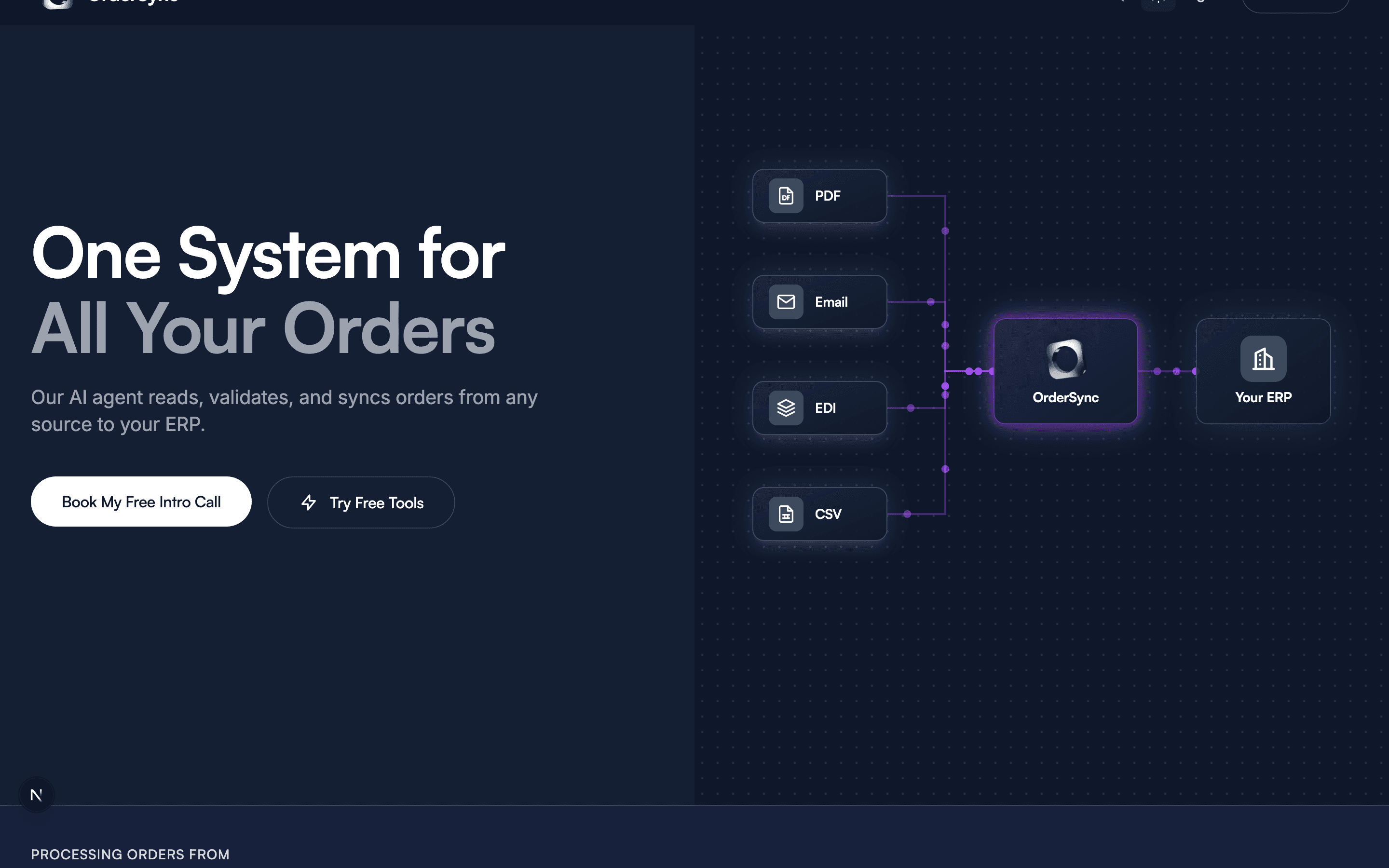
- The headline, “One System for All Your Orders,” and the diagram of every format going into the ERP.
User journey map
Key finding
Every path starts with stress, so each page has to reassure them and make the next step easy.
2 paths for each persona, from what sets them off to a booked call, or to staying in touch. Pick a persona and a path to switch the map.
Forced into EDI • The homepage to a call
1. Trigger
A retailer’s email
2. Search
Google or AI search
3. Land
The homepage
4. Evaluate
Logos and the FAQ
5. Book
Book a Call
Doing
A big retailer, like Walmart, sends its EDI requirements.
Searches “Walmart EDI requirements” and “SPS Commerce alternative.”
Reads the headline and the diagram under it.
Checks who else uses it and how long setup takes.
Picks a time for a 30-minute call with James.
Thinking
“This reads like a foreign language.”
“Is there a simpler path?”
“Does this solve my problem?”
“How long does it take to go live?”
“It’s 30 minutes, with no commitment.”
Feeling
The page
Before the site
A page on each big retailer’s EDI rules, and one on SPS Commerce alternatives
“One System for All Your Orders,” with every format flowing into the ERP
Customer logos, and FAQs on go-live time, IT and SPS Commerce
Book a Call in the header of every page
1. Trigger
A retailer’s email • Panic
A big retailer, like Walmart, sends its EDI requirements.
“This reads like a foreign language.”
2. Search
Google or AI search • Overwhelmed
Searches “Walmart EDI requirements” and “SPS Commerce alternative.”
“Is there a simpler path?”
The page A page on each big retailer’s EDI rules, and one on SPS Commerce alternatives
3. Land
The homepage • Wary
Reads the headline and the diagram under it.
“Does this solve my problem?”
The page “One System for All Your Orders,” with every format flowing into the ERP
4. Evaluate
Logos and the FAQ • Reassured
Checks who else uses it and how long setup takes.
“How long does it take to go live?”
The page Customer logos, and FAQs on go-live time, IT and SPS Commerce
5. Book
Book a Call • Ready
Picks a time for a 30-minute call with James.
“It’s 30 minutes, with no commitment.”
The page Book a Call in the header of every page
Competitive analysis
Key finding
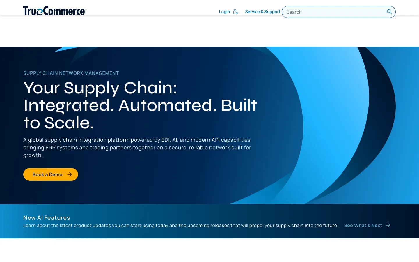
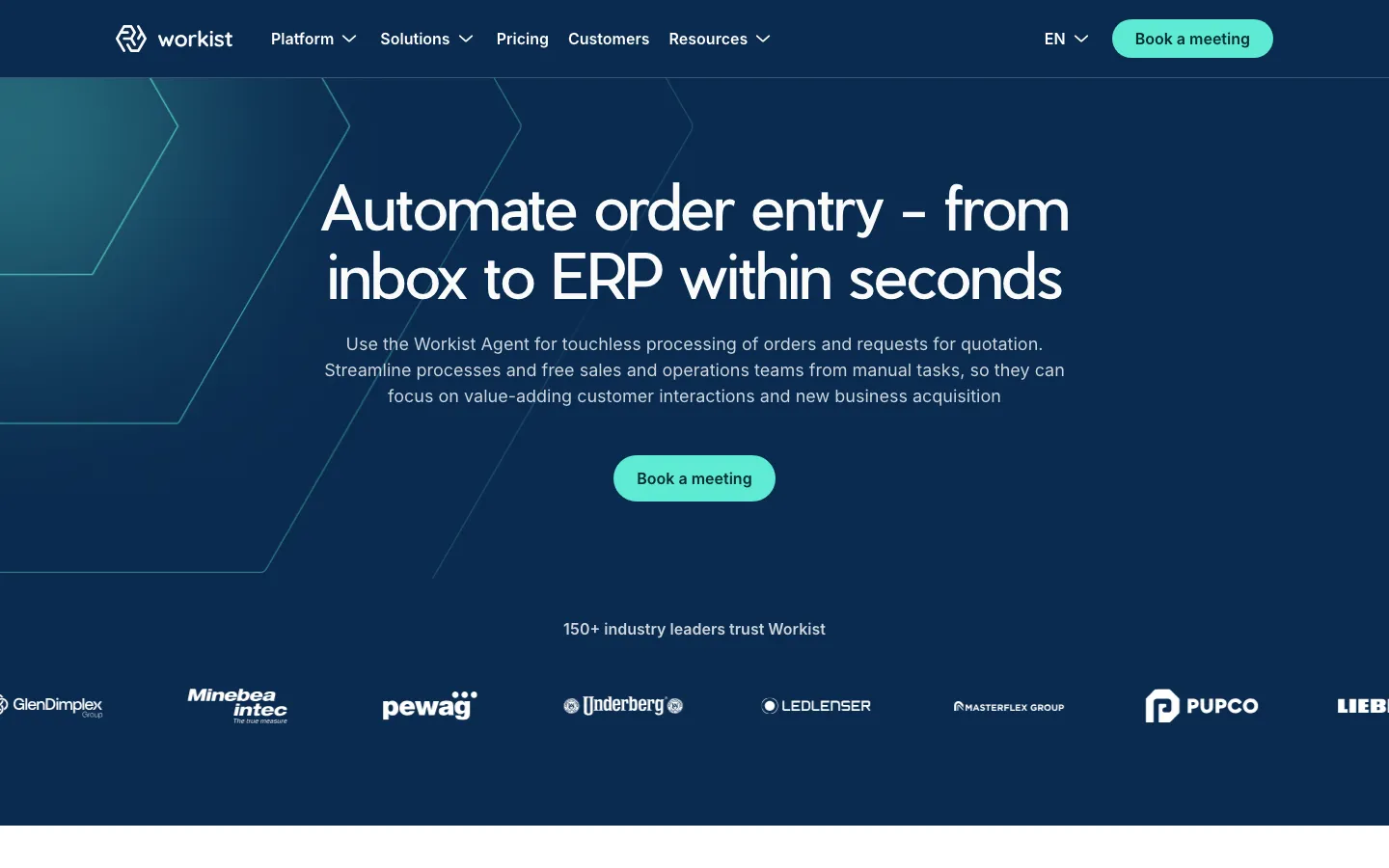
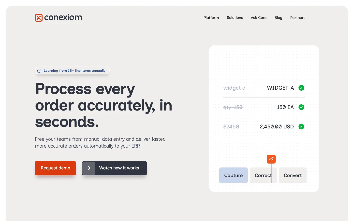
Competitors all asked for a demo, and almost none showed the product.
Everyone asked for a demo.
All 7 with a readable button asked for a demo or a meeting. OrderSync’s says Book a Call: 30 minutes with James.
Headlines said what they do.
5 of 9 said what they do with orders. OrderSync’s already did: “One System for All Your Orders.”
Almost nobody showed the product.
Only Conexiom did. OrderSync’s hero now shows every format going into the ERP.
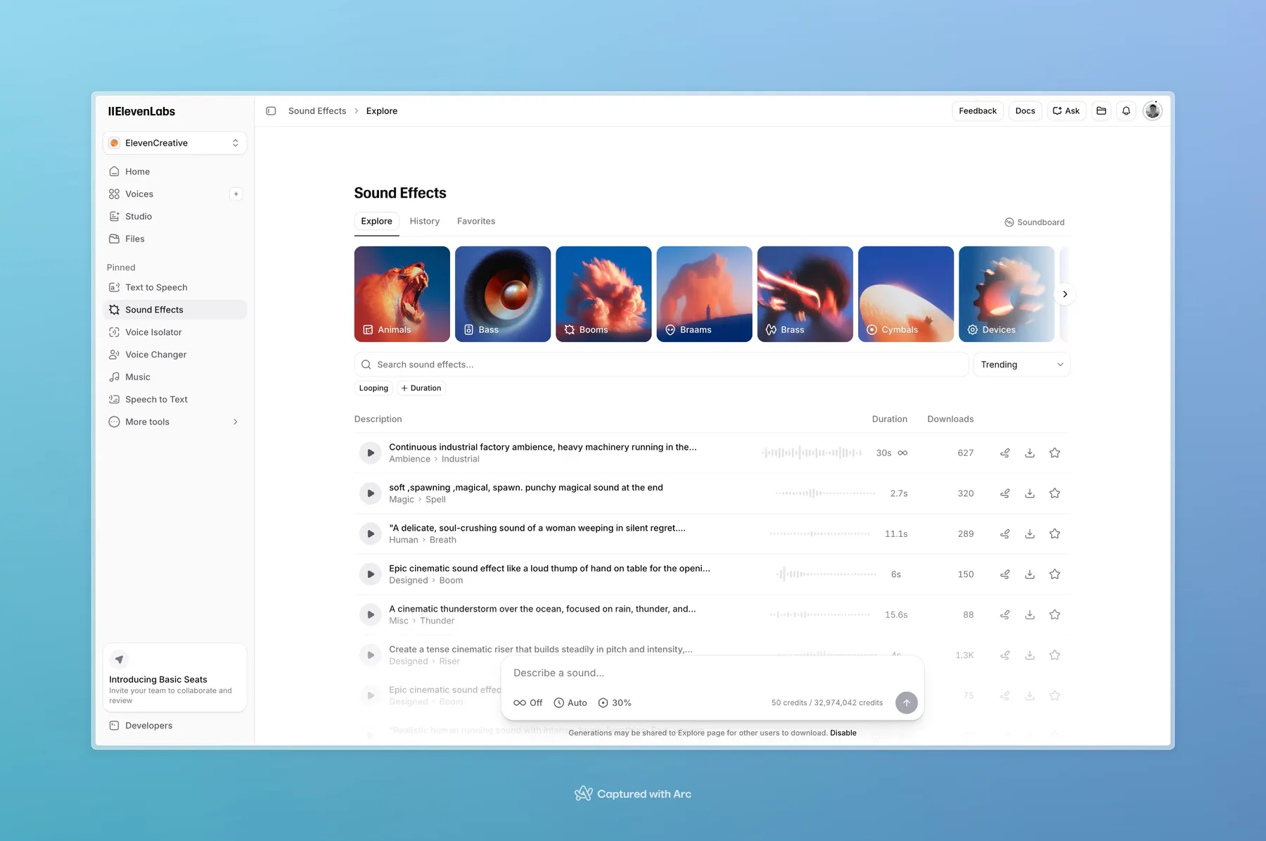
TrueCommerce
Workist
Conexiom
Ideation
Every section had to earn its spot on the way to Book a Call.
Information architecture
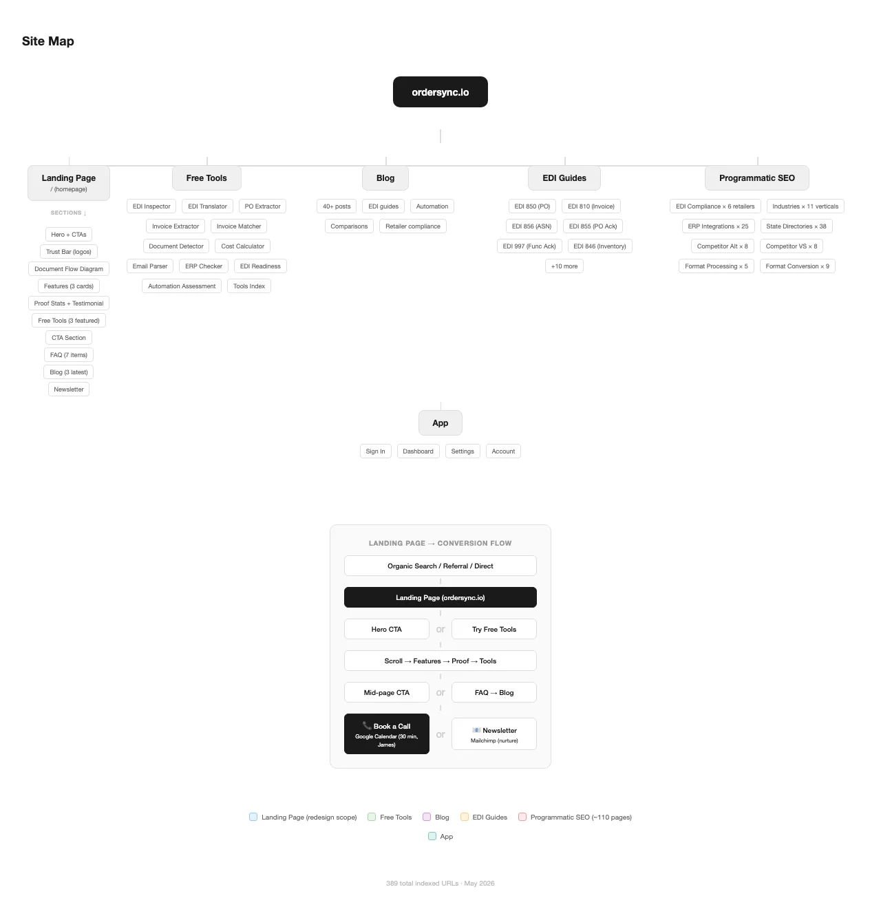
Alongside the wireframes, I mapped every page on the site: the homepage’s 10 sections, 11 free tools, the blog, the EDI guides, about 110 SEO pages and the app.
Wireframes
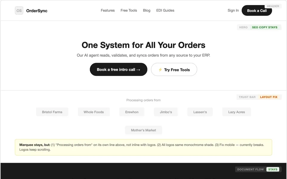
I wireframed the homepage 3 times, and most of the layout carried through to the final design.
Wireframe
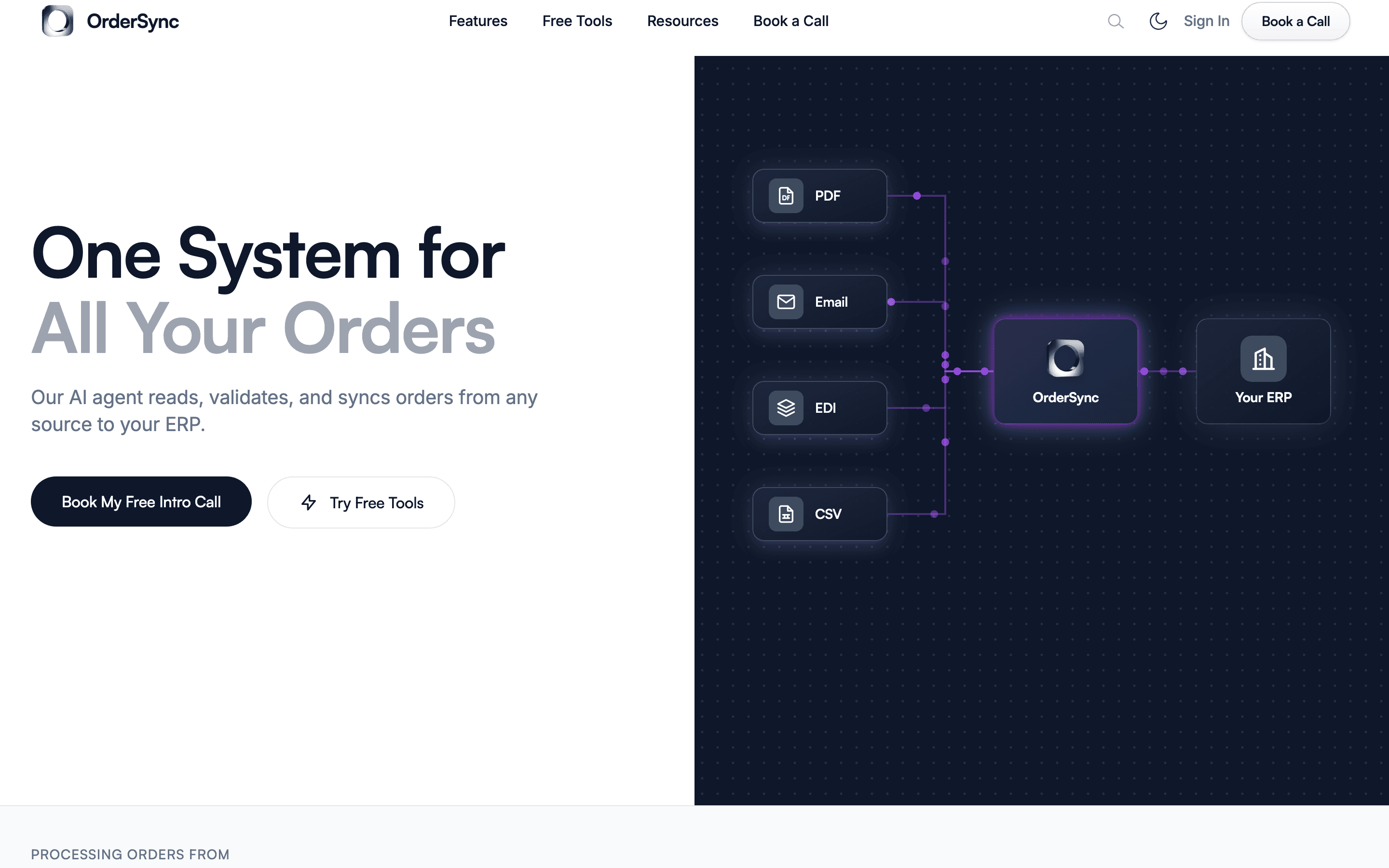
Final design
Visual direction
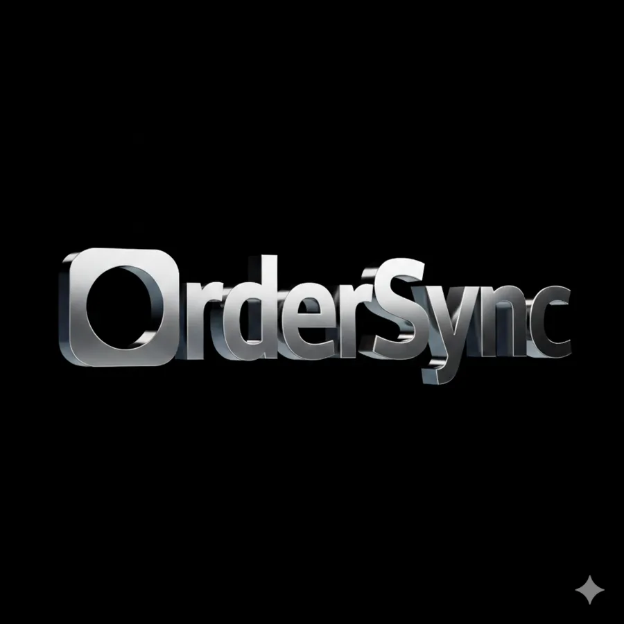
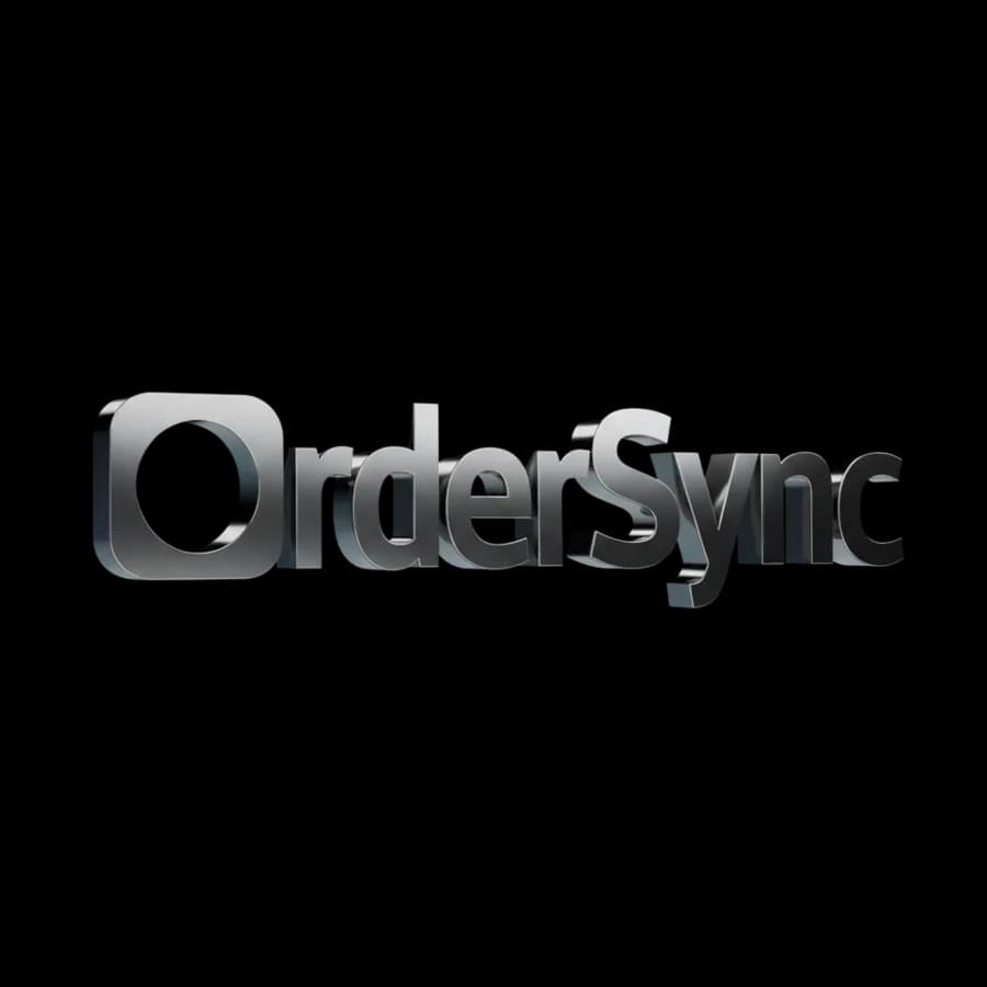
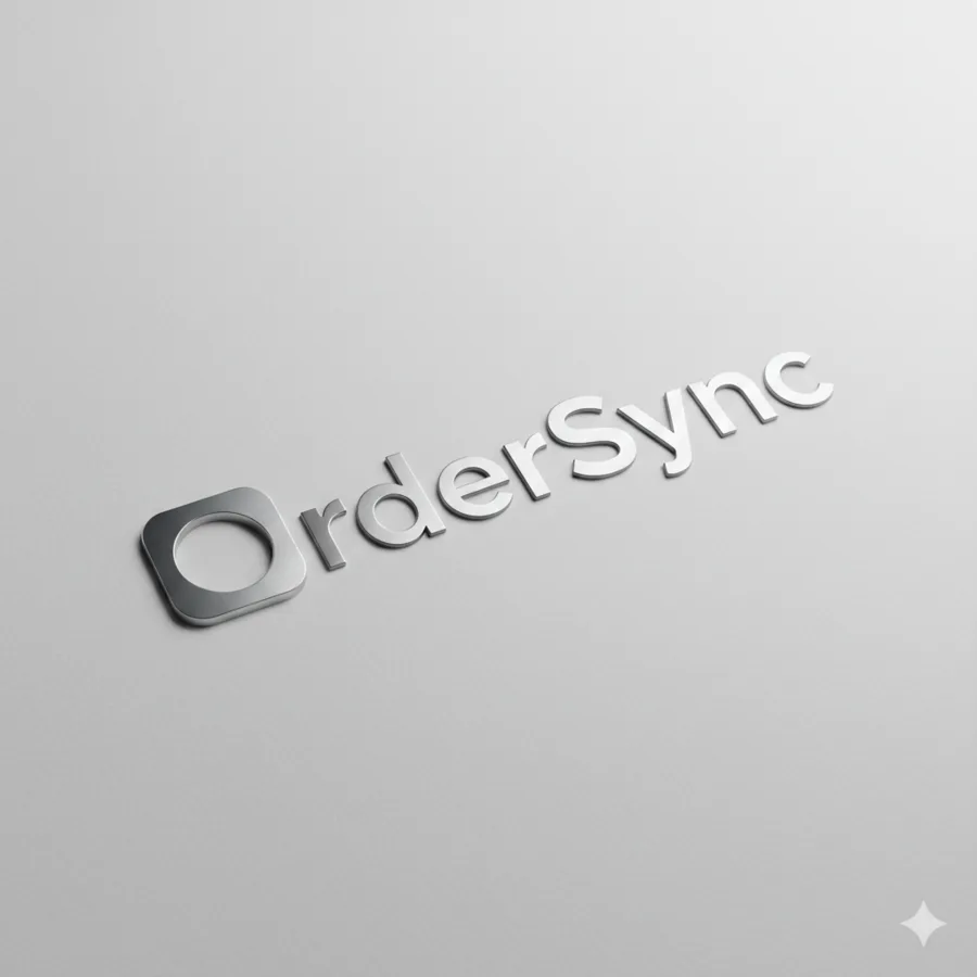
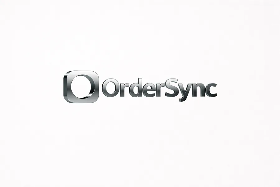
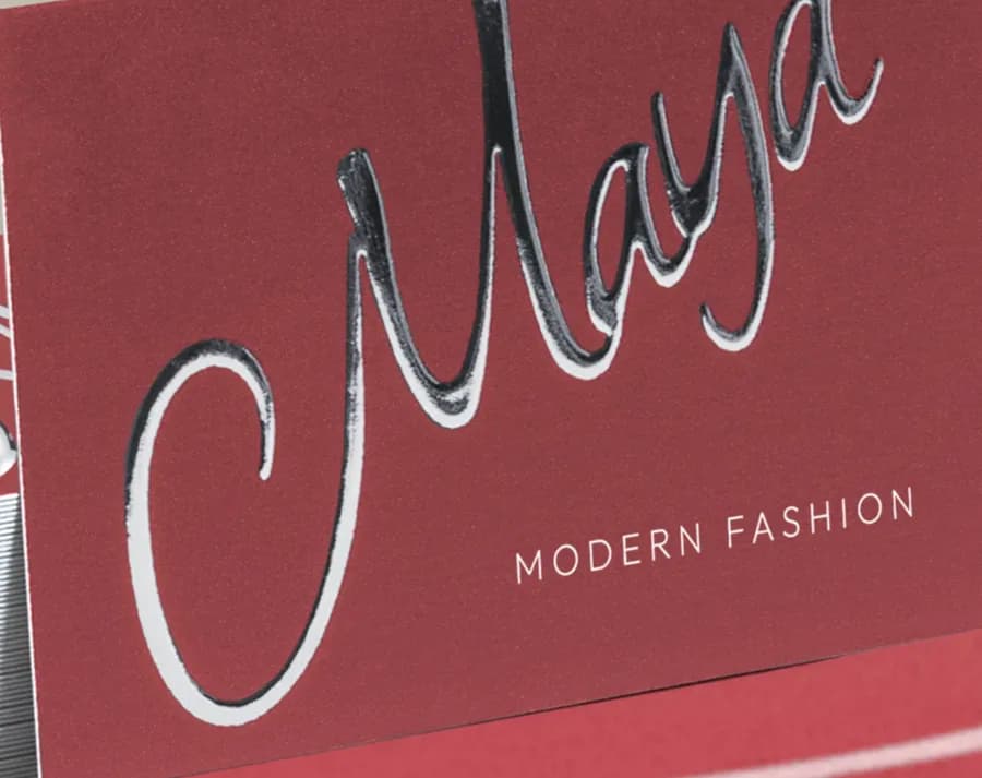
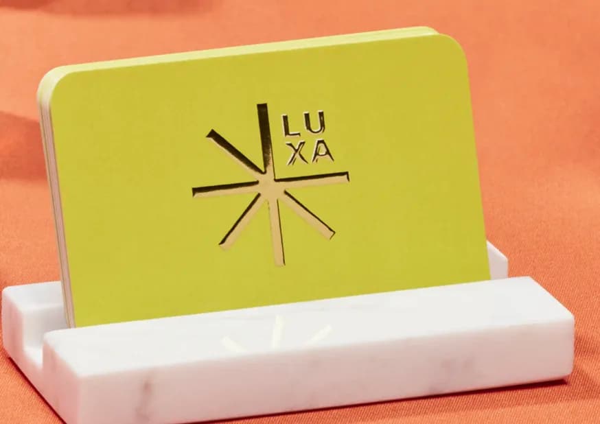
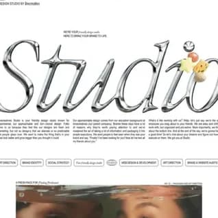
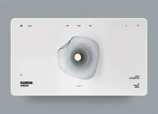
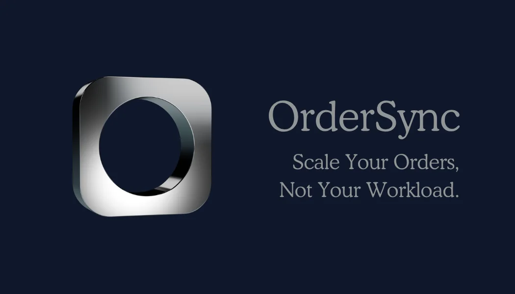
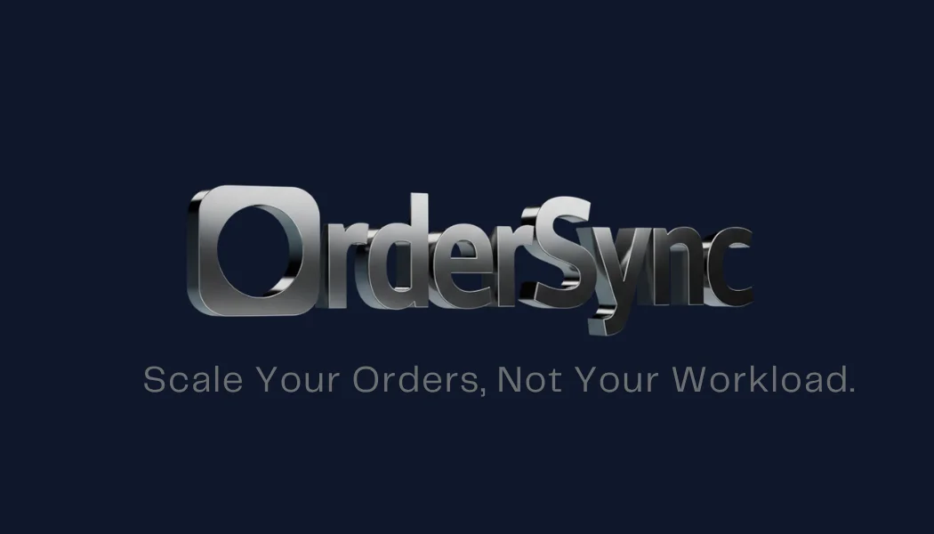
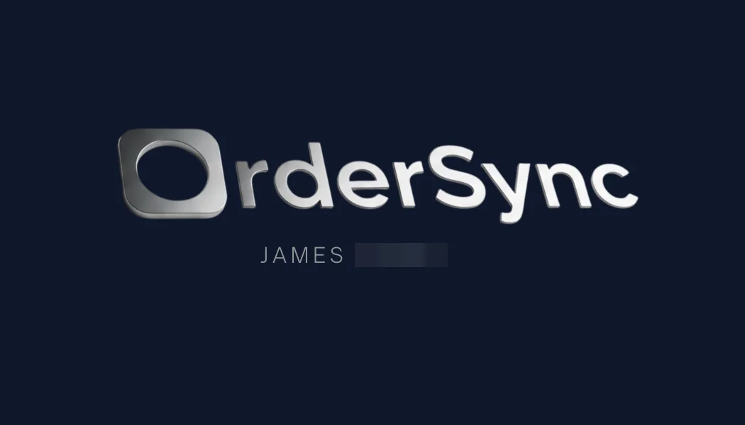
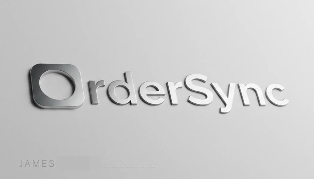
The logo started as a full chrome wordmark, and we simplified it to just the O. For the site, the question was how much chrome to bring onto the page. I collected chrome I liked, and left out the directions that went too far, because they didn’t match who we were selling to.
Logo exploration

The final mark
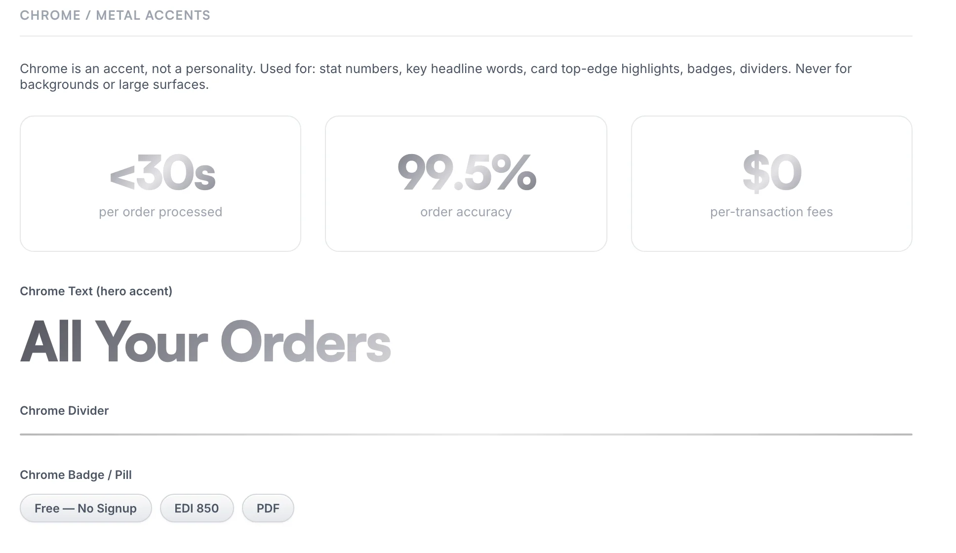
Kept: chrome as an accent
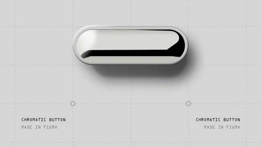


Left out: chrome as the whole look


Design directions
After the wireframes, I built 2 directions in code: everything on near-black, or light with chrome on a few accents. In between, I wrote the rule I kept for the rest of the project: “Chrome is an accent, not a personality.” The light direction followed it.
A. Dark, all chrome
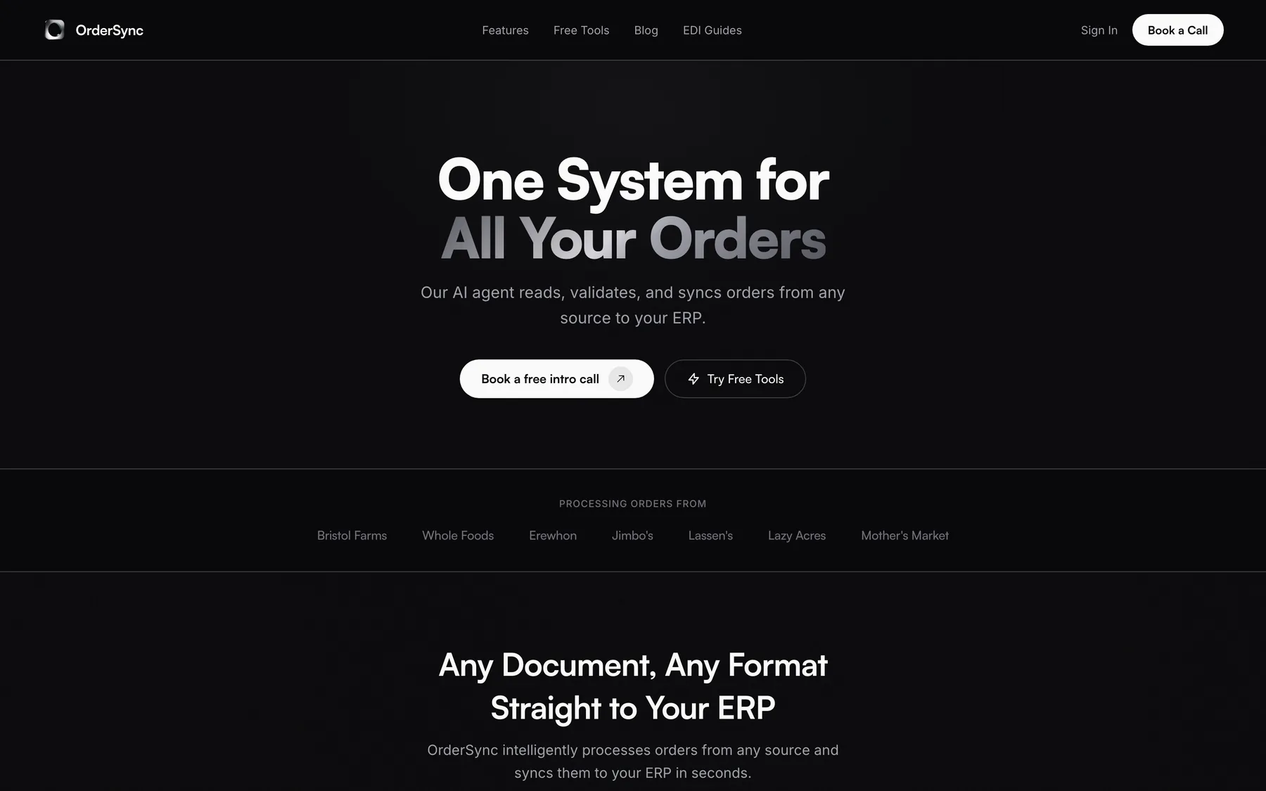
B. Light, chrome as an accent (chosen)
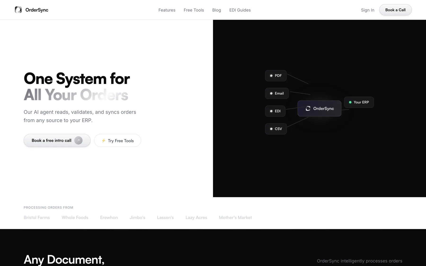
Later, the near-black became the navy already in OrderSync’s code, #0E172B, with 1 name instead of 4.
Design decisions
Clear over clever: every choice points to Book a Call.
A plain headline, with the line under it saying what OrderSync does
NN/g’s homepage guidelines: say plainly what the company does, in users’ words. In Nielsen’s tests, objective copy beat promotional copy.
One filled button, Book a Call, and Sign In as a plain link
NN/g on utility navigation: sign-in is a secondary action that can be played down if it stays top right. NN/g’s homepage guidelines add that emphasizing everything leaves nothing prominent.
Before

After

Book a Call as the only chrome button
The Von Restorff effect: the one item that looks different is the one people remember, as long as the emphasis is used sparingly.
An FAQ on setup time, IT and SPS before the call
NN/g on FAQs: prospects judge a vendor by whether its FAQ lets them set their concerns aside before spending money. See the FAQ in Research.
Free tools as a second path
NN/g’s B2B research: buyers resist handing over contact details, so a vendor has to earn credibility first.
No gradients, orbs or glass, in a calm, typical layout
Google’s study: simple, typical company sites made the best first impression, in as little as 17 milliseconds.
Before
After
Copy in buyers’ words
Nielsen’s heuristic #2: use the user’s language, not the company’s.
One system for every page
Nielsen’s heuristic #4, consistency and standards: a consistent site is predictable and easier to learn. See the system.
One place the research pushes back: in NN/g’s B2B study, buyers ranked pricing first of 28 kinds of information. OrderSync’s pricing fluctuates based on lots of factors, so they need to book a call.
None of these studied distributors or ops managers, so they explain why the choices should work, and only OrderSync’s booking numbers can show that they did.
Beyond the site: business cards
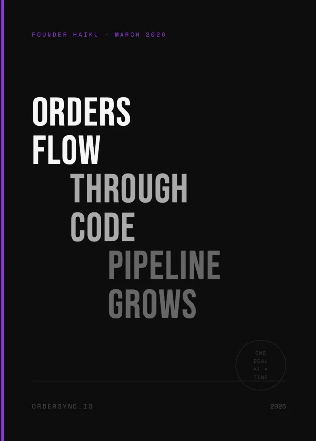
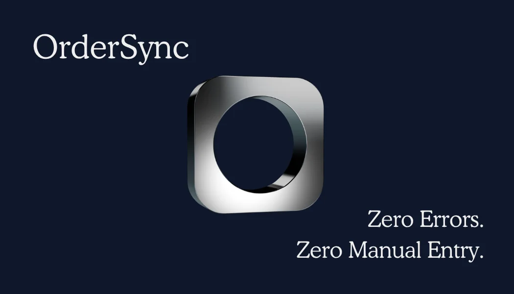
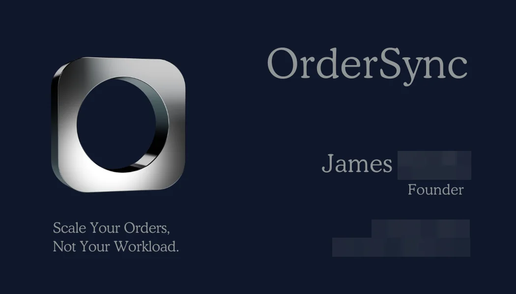
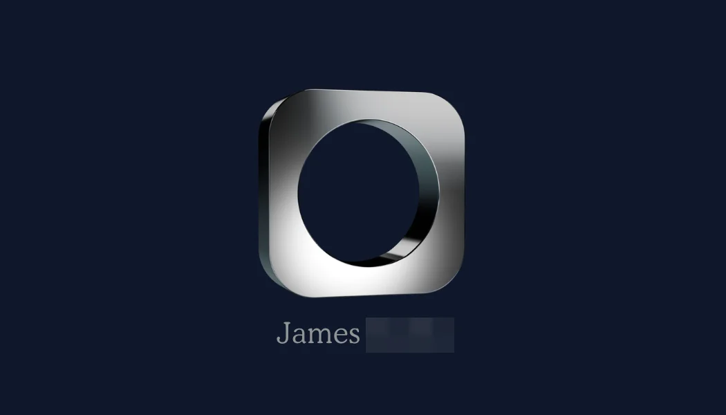
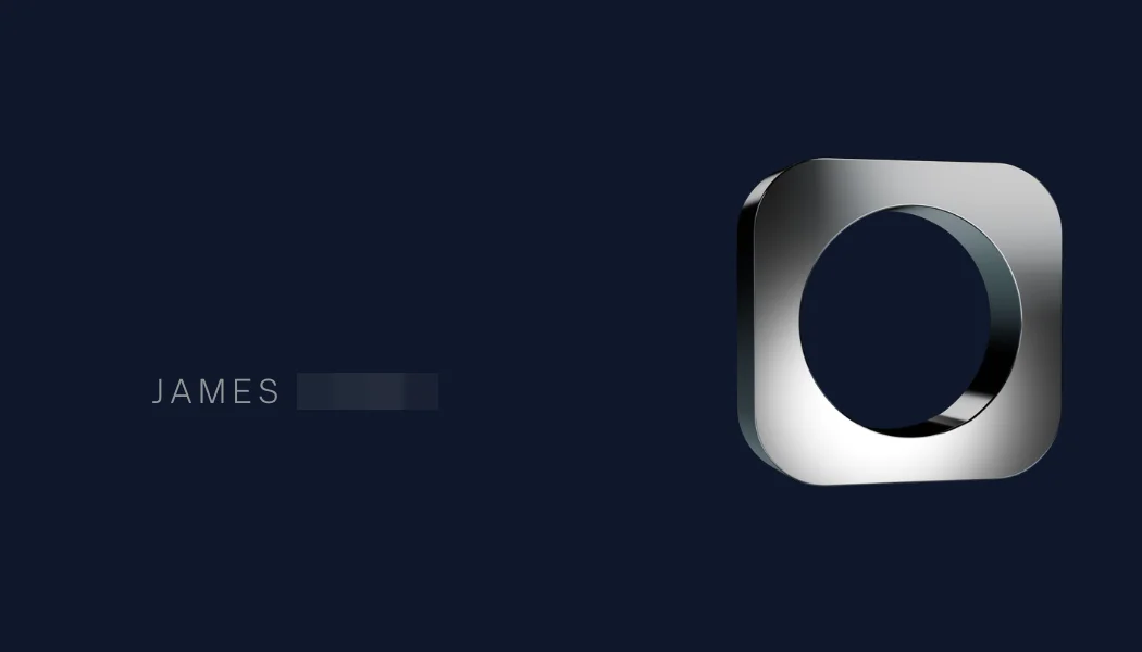
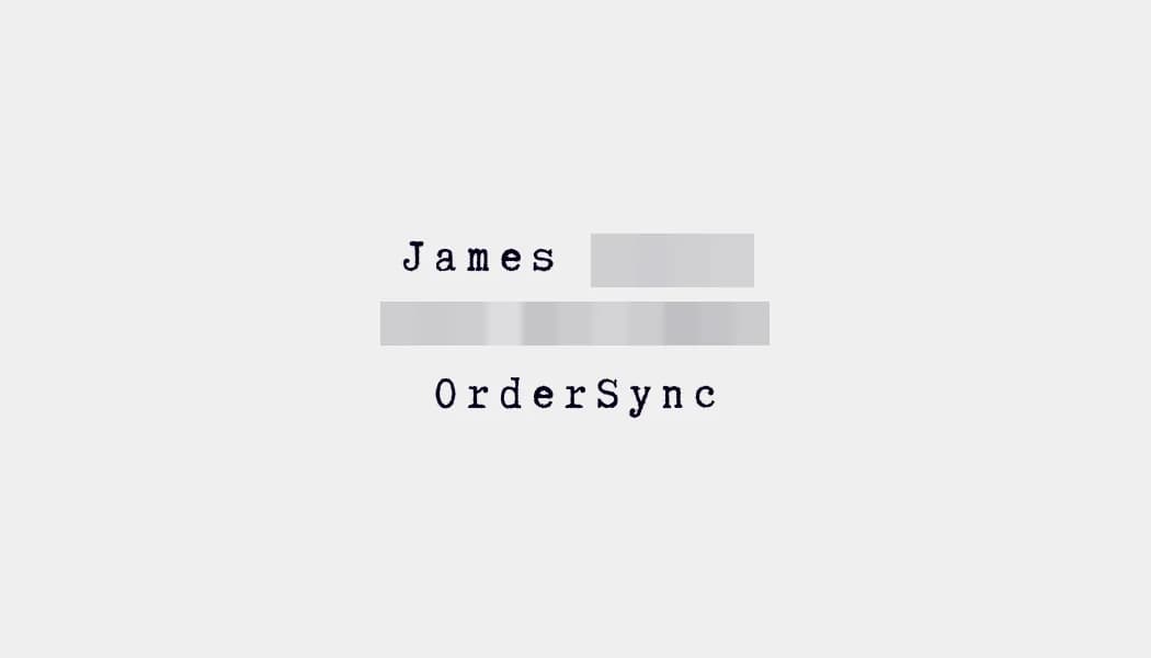
The same system went onto James’s business cards: navy and white, with chrome on one small thing. One side is just his name, number and the company, typed out. The other has a QR code to book a call, the site’s one action.
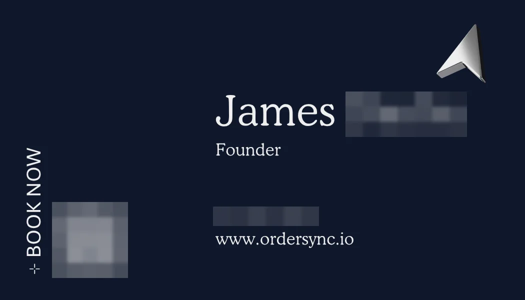
Iterations of the front
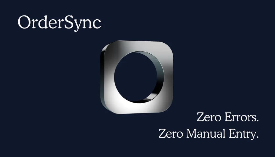
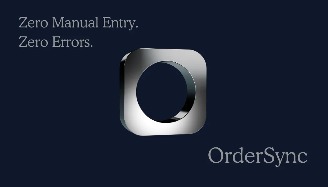
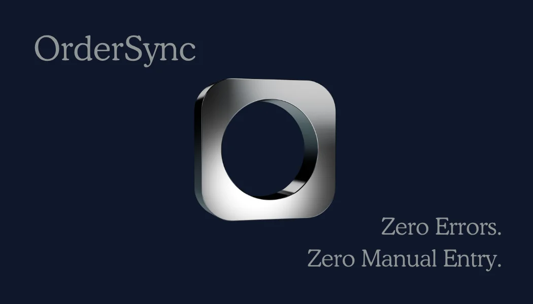

The site’s navy and chrome rule on the card
NN/g on consistency across channels: a consistent look makes a company seem organized and earns trust.
A labeled QR code to book a call, with the web address beside it
NN/g’s QR code guidelines: say what scanning does, since unlabeled codes aren’t trusted. In a 2025 national survey, 38% typed the web address instead of scanning.
Chrome on one small arrow
The Von Restorff effect: one item stands out only when nothing near it looks the same.
On the navy side, name largest, then title, then contact, with room around them
NN/g on visual hierarchy: make the most important thing biggest, use no more than 3 sizes, and leave space around it.
No “Zero Errors” tagline
The FTC requires evidence for factual claims, and in Nielsen’s tests, cutting promotional language made a site easier to use, because readers stopped questioning the claims.
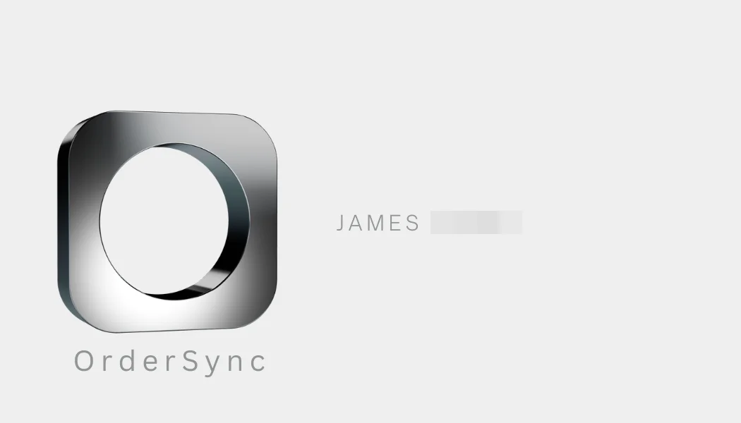
Directions I didn’t take


System
One set of colors and parts for every page.
The brand’s navy lived in the code under 4 names, so every tweak meant hunting through hex codes and names. I turned the look into a small system: 5 navies, 9 color roles that flip on their own in dark mode, and 4 shared components.
Color
Brand navy
navy-1
#0E172B • Darkest; replaces black
navy-2
#151F34 • Dark-mode page
navy-3
#1C274C • Headings and links
navy-4
#0F172A • Call-to-action band, diagram
navy-5
#1C274C • navy-3 at 30%, logo strip
9 color roles, light and dark
- surfacePage: #FFFFFF / #0E172B
- surface-mutedBands: #F9FAFB / #151F34
- surface-inverseDark sections: #0E172B / #FFFFFF
- contentText: #0E172B / #FFFFFF
- content-mutedSecondary text: #64748B / #D1D5DB
- content-subtleTertiary text: #9CA3AF / #9CA3AF
- content-linkLinks: #1C274C / #E5E7EB
- content-inverseText on dark: #FFFFFF / #0E172B
- lineBorders: #E5E7EB / #374151
Type
Aa
Satoshi
Headings and buttons
Aa
Inter
Body text
- Display • 72 / 78One System for
- H1 • 48 / 58Still Typing Orders
- H2 • 35 / 45Catch Errors Before They Cost You
- H3 • 24 / 32How long does it take to go live?
- Body • 16Our AI agent reads, validates, and syncs orders from any source to your ERP.
Components
Button
Eyebrow
Section surfaces
Chrome accent
Chrome shows up twice: on the Book a Call pill in the header, and as a silver glint that sweeps once across each headline’s key words. Hover the gray words to replay it.
Pill
Glint
One System for
All Your Orders
- Times the code used a named color role, like surface or content, instead of a raw color, the day the redesign shipped.
- 2,480
- Files that now use the same FAQ component instead of their own.
- 26
To keep it that way, I wrote a script that visits every page in the sitemap, screenshots it in light and dark, flags any color outside the system, and compares each screenshot with the last approved one.
Results
The redesign shipped on June 19, 2026, as 8 pull requests touching 237 files, from the homepage to sign-in and billing.
Before
After
After launch
PostHog started recording on June 26, a week after launch, so these numbers show how the new site performs rather than a before and after.
- Calls booked through the calendar, June 26 to October 9, 2026. 6 came from visits with no page view, so they can’t be traced back to a page.
- 8
- People who started on the homepage clicked Book a Call at 2.4 times the rate of the site as a whole: 4 of 52, against 11 of 349, June 26 to October 8, 2026.
- 2.4×
- Visits that started on each page, June 26 to October 9, 2026. More start on the free EDI Inspector than anywhere else.
- 196 vs 57
From the homepage to a booking
- People whose first page was the homepage.52
- Of those 52, people who then clicked any Book a Call button.4 of 52
- Of those 4, people who then opened the window to pick a time.3 of 4
How far down the homepage
- Homepage visits that went on to another page. Scroll depth can only be measured for these.45
- Of those 45, visits that scrolled past two thirds of the page, where the FAQ and the closing call to action are.12 of 45
3 of the 4 people who clicked Book a Call went on to open the booking window, so the step from button to booking works.
The paths people took
| Path from the journey map | What PostHog shows |
|---|---|
| The homepage to a call | 57 visits started on the homepage, 45 of them never opened a second page, and 6 people went on to open the booking calendar. |
| The EDI Inspector first | 196 visits started there, more than on any other page. |
| A free tool first | 38 visits started on a tool page, and 2 of the 8 finished bookings came from those visits. |
| A retailer’s EDI page | 8 visits started there, and none booked in the same visit. |
| A comparison to a call | No one booked in a visit that started on a comparison or the SPS Commerce post. |
| Not buying yet | 24 visits started on the blog. Newsletter sign-ups have no event of their own, so PostHog can’t count them. |
Next: move the FAQ’s answers higher, since 12 of 45 visits reach the bottom of the homepage, and give the EDI Inspector a clearer path to a call, since 3.4 times as many visits start there as on the homepage. The tracking needs a fix too: PostHog has 8 finished bookings since June 26, but 6 of them came from visits with no page view, so they can’t be traced back to a page.
Reflection
The research did the most work on the words. It told me what buyers worried about and in what order, and the look followed from who was reading: business people who don’t want the wheel reinvented.
Next time I’d talk to buyers myself. Reviews told me what went wrong with other vendors, but not how someone reads our page. And I’d set up tracking before launch, so there’s a before to compare with.
How I built it
Next.js and Tailwind, with color tokens that flip for dark mode, 4 shared components, and a script that screenshots every page to check it against the system. The engineering side has the details.