Portfolio redesign • 2026
Turning a developer portfolio into a design portfolio
Overview
A designer told me my portfolio read like an engineer’s, which is a problem when you’re applying for product and UI/UX roles. I built it when I was first starting out in software engineering, and as my work moved toward design, the site never did.
So I audited it, studied 265 designer job posts and 10 portfolios of new design hires, and redesigned it from a blank page to lead with design.
A portfolio is a product that’s never finished, which makes it the perfect medium for user feedback loops. Each round of testing shapes the next version, so it keeps getting better.
- Timeline
- September to October 2026
- Tools
- Figma, FigJam, Next.js, Tailwind CSS
- Scope
- Website redesign
Problem
How might I put my design work first for a design reviewer, without hiding the engineering that sets me apart?
Design teams look for craft, taste and shipped work. My portfolio led with code.
When I walked through the old site the way a design hiring manager would, the evidence was everywhere, starting with the first screen.
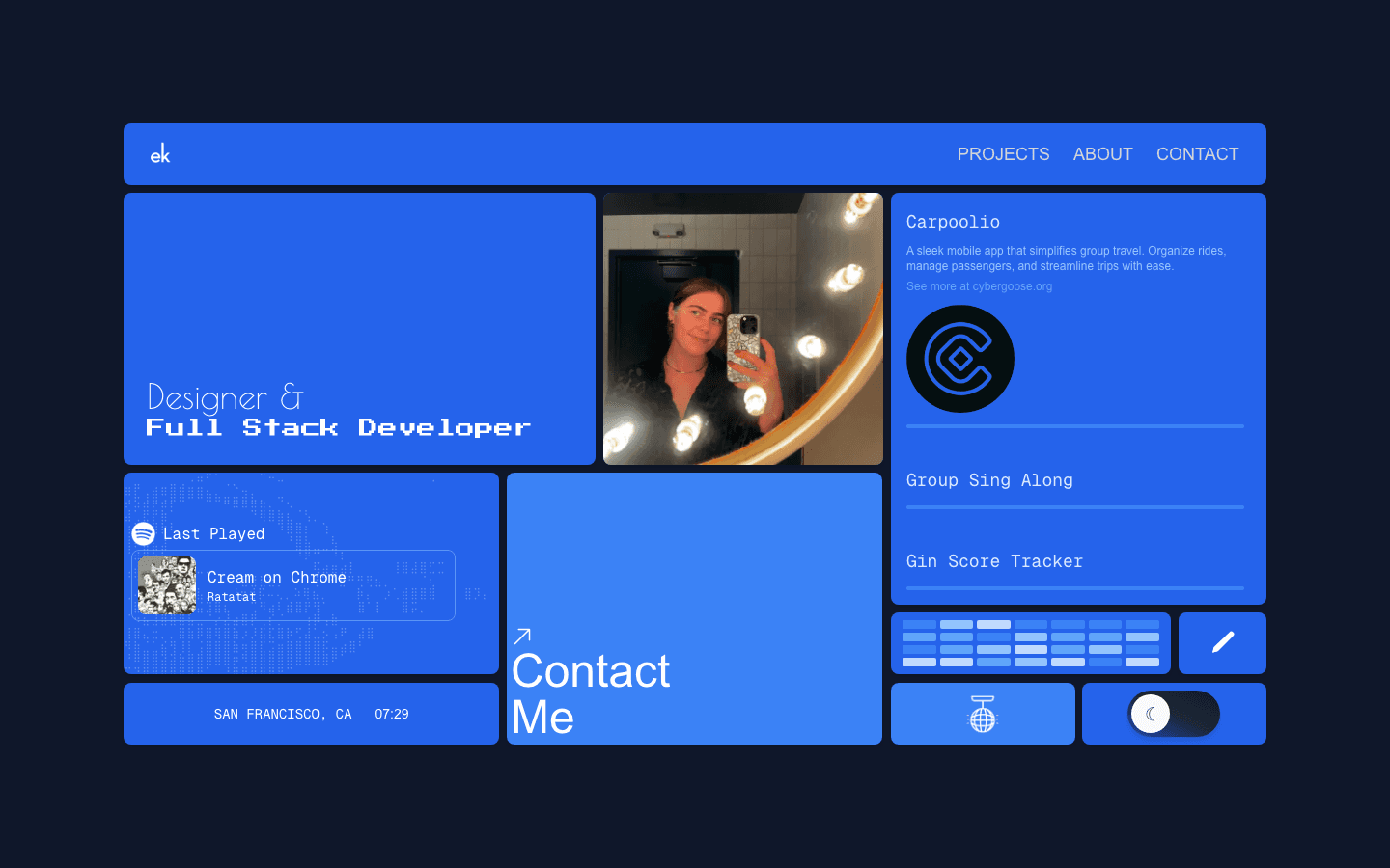
The type picked a side
“Designer &” is a thin script and “Full Stack Developer” a heavy pixel face, so the headline argued before anyone read it.
1 tile in 10 was about my work
The rest were a photo, my last-played Spotify track, a clock, a GitHub graph, a blog link, a disco-ball mode, a dark-mode toggle and a contact link.
Carpoolio
A sleek mobile app that simplifies group travel. Organize rides, manage passengers, and streamline trips with ease.
See more at cybergoose.org
Group Sing Along
An interactive platform that allows users to form or join singing groups. Effortlessly search for song lyrics and synchronize them in real-time.
See more at cybergoose.org
Gin Score Tracker
A simple score-tracking app for Gin Rummy.
See more at cybergoose.org
The visual language was a developer’s
Pixel display type, monospace body text, and saturated blue on every tile. A disco-ball button wore the same blue as my projects, so color did nothing to show what mattered.

The copy was about code
Across the homepage and About page, I mentioned development, coding or software 13 times and design 2 times. Code is only 2% of what design job posts ask a portfolio to show.
- Development, coding or software
- 13
- Design
- 2
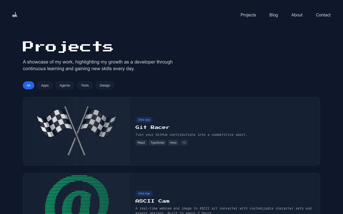
The projects page was sorted for engineers
It promised “my growth as a developer,” opened with Git Racer and a 2-hour ASCII camera, and put my only design case study 4th of 13.
The details people check first were wrong
What people see when I paste erinkerr.me into an application or a message, rebuilt from the site’s own metadata. It introduces me as a software engineer before anyone visits. Also, the clock tile still said San Francisco, even though I’m applying for jobs in New York. Small, but they’re the kind of details a design reviewer notices.

erinkerr.me
Erin Kerr — Software Engineer & Developer Content Creator
Erin Kerr is a self-taught software engineer building in public. Explore projects like Git Racer, Carpoolio, and Group Sing Along, read the blog, or get in touch.
Goal
Make the case for design without hiding the engineering.
How I’ll know I’ve succeeded
In a first-click test, a design reviewer’s first click on the homepage lands on a design case study within 20 seconds.
Research
What are hiring teams looking for?
In pursuit of my own curiosity, I pulled 265 UI/UX and adjacent JDs from 98 companies, with 182 explicitly mentioning portfolios. Then I extracted portfolio-related lines, clustered them into themes, and built a map using a small local dataset.
I set filters on the map to show results based on job title, knowing the target “users” of my portfolio would be design leads, hiring managers, and fellow UX professionals. I wanted this section to be an opportunity for those reviewing my portfolio to learn something new or to spark some curiosity about what the research says about their role.
What the map showed
| What they ask for | Chart | Portfolio ask | Whole post |
|---|---|---|---|
| Taste & quality bar (“curate hard”) | 34% | 91% | |
| Shipped work | 25% | 83% | |
| Relevant surfaces | 21% | 77% | |
| Visual craft | 21% | 72% | |
| Systems thinking | 17% | 92% | |
| Prototyping & code | 2% | 88% |
A portfolio is judged on craft and taste.
Curation was the single biggest portfolio ask. A few pieces with a clear point of view beat a long list of okay work, and my old site was a long list.
Code is valued in the job, but it isn’t what the portfolio is judged on.
88% of posts mention prototyping or code somewhere, but only 2% of portfolio asks do. My engineering is a real advantage, but it should support the design work, not lead.
Shipped work outranks concepts.
Live, used work came 2nd. I have shipped apps with real ratings and users, and my old site hid that behind tech-stack chips.
Posts expect a clear story.
92% of posts mention reasoning, rationale or storytelling. Case studies should run problem, exploration, decision, result, which is why this one is structured the way it is.
Landscape analysis
I looked at 10 portfolios from people hired into their first design or design engineering job at startups, mid-size companies and 1 apprenticeship. 7 are product designers, 5 of them career switchers like me, and 3 are design engineers. I coded all 10 on the same 20 features, measured 15 of their case studies, and checked each pattern against the 139 product and UI/UX posts from the job-post research that ask for a portfolio.
Sara Mirowitz
4 notesCaitlin Brisson
Janelle Academia
Amy Lima
Olivia Gibson
Miggy Fajardo
Leo Fu
Mitul Shah
Mary Jiang
Joyce Jiang
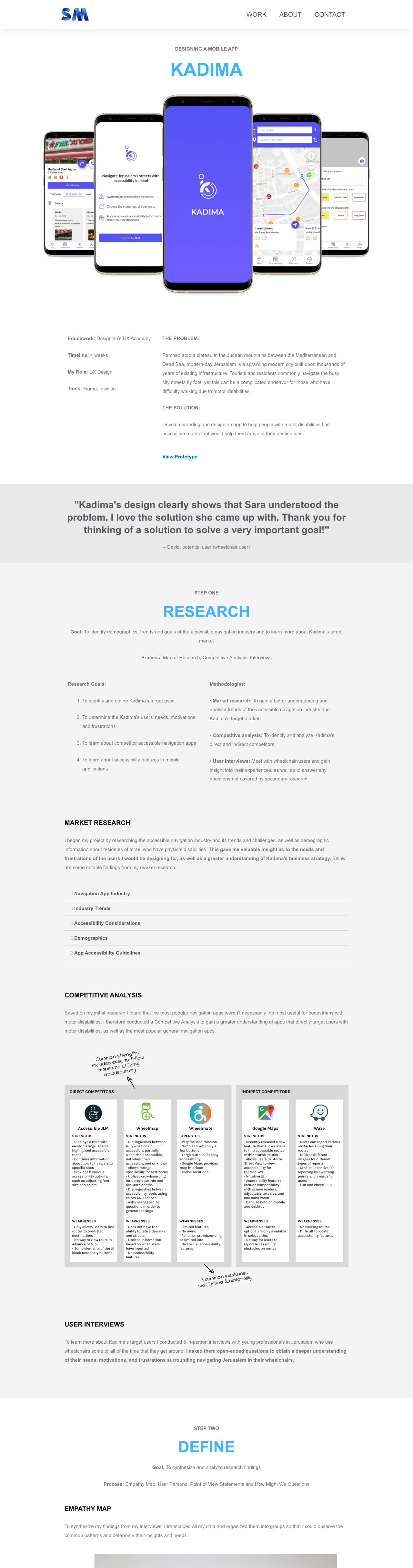
Product designer · Career switcher
Sara Mirowitz, opens their portfolio
UX Designer at Voiceitt, 2020. Special-ed teacher, then a design bootcamp. She was the only designer at a startup building speech recognition for people with speech disabilities.
- Leads with
- “I’m a User Experience Designer who creates inclusive experiences for users of all abilities.”
- Projects
- 4 case studies and no side projects
- Case studies
- 1,800 to 2,300 words each
What it suggests for my design
Her old field shaped her capstone, and the capstone matched her employer. It points to testing a case study that draws on my research background, aimed at health tech, instead of only mentioning that background.
Select a numbered highlight to see why I called it out. Captured from the Wayback Machine, January 2022. Her 2020 homepage’s styles weren’t archived, so this shows the case study. See that version
What the portfolios showed
Product designers showed 3 to 5 case studies.
All 7 did, and the median was 4. Taste and curation is also the top portfolio ask in the job posts.
Every case study followed the same shape.
A facts block, the problem, research and testing with real people, the design, and what they learned. Most ran 1,000 to 2,300 words with about 20 images. Only 1 reported shipped results.
Real work went first.
All 3 who had client, lab or internship work led with it. Concept projects didn’t hold anyone back, since 5 of the 7 product designers had at least 1.
Designers named the role, engineers showed the work.
6 of 7 product designers said “designer” on their first screen. The 3 design engineers had no case studies and were hired on live projects, small demos and short posts.
The job posts point the same way for junior roles. At entry and mid level, asks for a user-centered process rise from 15% to 21% of portfolio mentions, and asks for measurable impact fall from 14% to 8%. Junior designers are judged more on how they work than on numbers they moved.
What it suggests for my design
None of this is decided yet. These are the ideas I’m taking into reviewer sessions, each tied to the evidence above.
- 3 to 5 design case studies on the main path, with real, shipped work first and side projects somewhere else.
- Fewer, deeper case studies in the shape the hires used. My 2025 case studies ran about 700 to 850 words, and theirs mostly ran 1,000 to 2,300.
- A first line that names the role, then a test of which angle reviewers remember: research and the brain, building end to end, or AI-native work.
- A clear place for my psychology and neuroscience background, tested 3 ways: a line on the homepage, About only, or a case study that draws on it.
- Engineering that supports the design work instead of leading it. Code is 2% of portfolio asks for design roles, but it was the whole case for the design engineers.
How I measured. I looked at each portfolio as it was when they were hired, using the Wayback Machine where a site has changed since, and counted words with a headless browser. 10 is a small sample, and all 10 got hired, so this shows what was typical and enough, not what caused the hire. 3 of the 5 career switchers came from 1 bootcamp’s success stories. Where an archived page lost its styles or images, the recording uses the closest version that still renders and says which one.
Talking to people
In progress: Reviewer sessions
Each person reviews the old site as if hiring a junior product or UI/UX designer with 2 minutes before their next meeting, thinking out loud: what they remember, where they stop, and whether they find a design case study.
Exploration
I threw out my first direction and started from a blank page.
First direction: a design page beside the old site. I added a separate /design landing page with 4 case-study cards, a “how I work” section and my tools. It sat beside the 2025 site instead of replacing it, so anyone landing on the homepage still met “Full Stack Developer” first. I threw it out.
Starting over, and keeping the old site. On September 25 I froze the 2025 site at /archive/2025, unchanged, with its own copies of every component so future redesigns can’t break it. The idea came from Lynn Fisher’s archive, where every edition of her site stays online. It let me start from a blank page without deleting work I’m proud of, and anyone can compare the 2 versions.
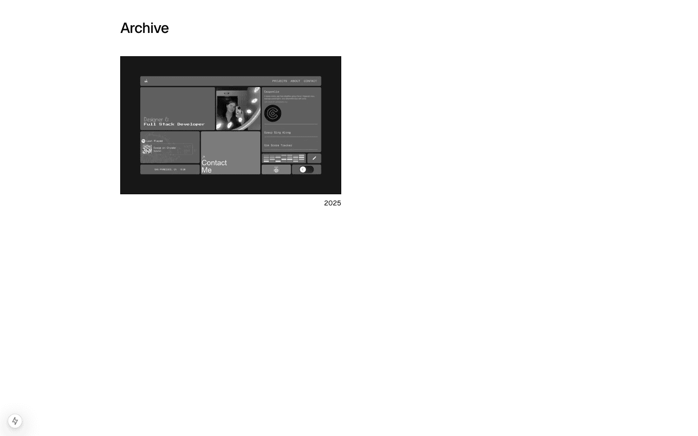
References.
- Lynn Fisher’s archive: every past edition of a site, kept online.
2025
erinkerr.me
- Home10 tiles, 1 about my work
- Projects13 projects, Git Racer first
- Blog
- About
- Contact
2026
erinkerr.me
- Work6 case studies
- Fun7 side projects
- About
- ArchiveEvery past edition, unchanged
Prototyping & testing
I prototyped in code, so reviewers test the real thing.
I prototyped in code instead of static mockups. That’s how I work fastest, and it means reviewers see real type rendering, the real switch and the real mobile layout.
Versions so far
- Sep 20
A separate design page beside the old site(dropped) - Sep 25A blank homepage, with the 2025 site frozen at /archive/2025
- Sep 26The archive index, pared back to a heading, a thumbnail and a year
- Oct 1Work, Fun and About pages
- Oct 1The designer/engineer switch under the headline
- Oct 1The engineer side, which inverts the whole page
- Oct 1Case studies with a design side and an engineering side
How I’ll test it: I run a first-click test on the homepage, then after 2 minutes ask reviewers which design project they remember.
Why 20 seconds fits: Nielsen Norman Group’s research on how long people stay on web pages found many leave within 10–20 seconds unless the page shows its value quickly. My new homepage puts case studies on the first screen, so 20 seconds is realistic.
In progress: Testing
Reviewers see the old site and then the prototype, with the same scenario and the same questions. What testing shows, and what I change because of it, goes here.
Ideas to test
8 ideas in the prototype, and how I’ll test each one.
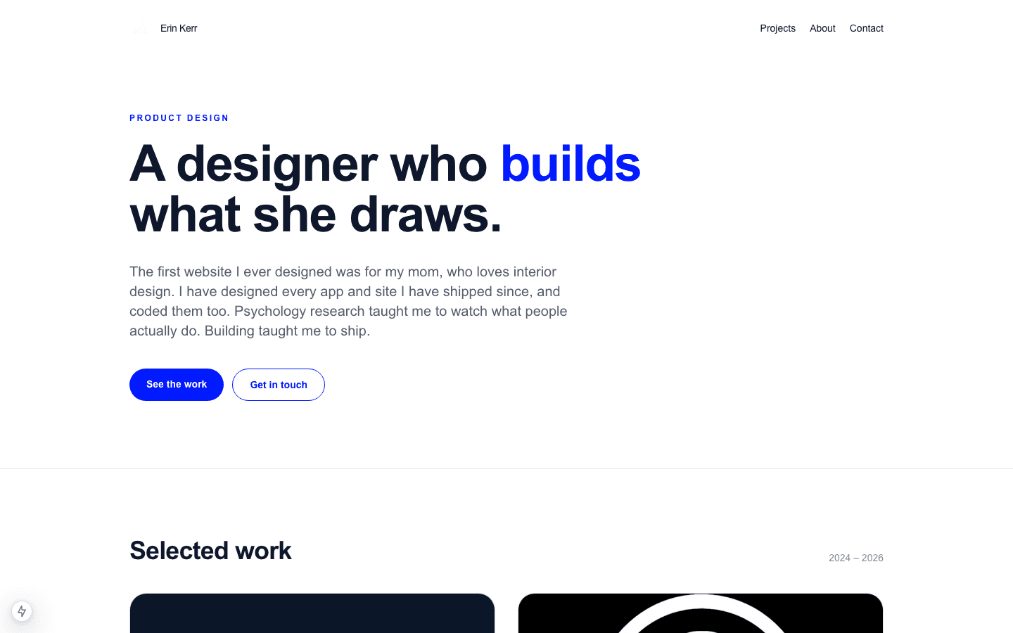
None of these are final. Each one is in the prototype so reviewers can react to it, and each comes with the evidence behind it and what would tell me it works.
A headline where design is the noun
The idea. The first line makes design my identity and engineering how I work: “I’m Erin, a designer who engineers.”
Why. 6 of the 7 product designers in the landscape said “designer” on their first screen. Code is valued in the job posts, but it’s 2% of what they ask a portfolio to show.
How I’ll test it. Show reviewers 2 versions of the first line and ask what job I’m applying for. The 2nd version adds an angle, like research or building end to end, to see which one they repeat back.
2025
2026
I’m Erin, a designer who engineers.
A switch for the engineers
The idea. A toggle with a pen nib on one side and </> on the other moves the italics from “designer” to “engineers” without shifting the words around them. The side is saved in the URL as ?side=engineer, so one site could serve both audiences.
Why. The 2 kinds of hires in the landscape were judged on different things. The product designers had case studies, and the design engineers had shipped code, small demos and short posts.
How I’ll test it. Watch whether design reviewers notice the switch and whether it reads as a plus or a distraction, then ask an engineer to find the engineering work. The alternatives to compare are a separate engineering page and a short note on how each project was built.
a designer who engineers. (designer side)
a designer who engineers. (engineer side)
Curating hard
The idea. 6 case studies on Work, and 7 side projects on a Fun page, “Side quests, small tools, & one app Apple rejected.” The widgets are gone.
Why. Curation is the top portfolio ask in the job posts. The research also pushes back on the number: every product designer in the landscape showed 3 to 5 case studies, so 6 is above that range.
How I’ll test it. Compare a Work page with 4 case studies against one with 6, and track which projects reviewers open and which ones they remember.
Titles that say what it does
The idea. Each title says what the project does for people, and the label under it shows proof, like a rating or active users, instead of a tech stack.
Why. Shipped work is the 2nd-biggest portfolio ask. In the landscape, everyone who had real work put it first, and Mitul was hired as a design engineer on project cards with real numbers.
How I’ll test it. After 2 minutes on the site, ask reviewers which projects they remember and what they remember about them. A title or a proof number coming back means it worked.
| 2025 tile | 2026 tile |
|---|---|
| Gin Score Tracker | Gin Rummy scores, round by roundGin Score Tracker • App Store |
| Group Sing Along | Lyrics everyone in the room sees in real timeGroup Sing Along • ~155 active users |
| Carpoolio | Group travel app, from first sketch to acquisitionCarpoolio • 4.9★ App Store |
Thumbnails built from the real thing
The idea. Each tile is 1 brand color with 1 object on it. Where possible, the object is real UI rebuilt in code, so it stays sharp and shows the design itself. These 3 are live components, not images.
Why. Visual craft is almost a quarter of portfolio asks, and interaction and flows is 19%. The landscape doesn’t point to any one visual style, so this idea rests on the job posts more than on other portfolios.
How I’ll test it. Ask reviewers what each project is from its tile alone, before they read the title.
 OrderSyncColor tokens
navy-1
#0E172B
navy-2
#151F34
navy-3
#1C274C
accent
#9333EA
Book a CallTry Free ToolsOrderSync’s own color tokens and buttons
- EmailOrderSyncERP
The order agent’s flow, Email to ERP
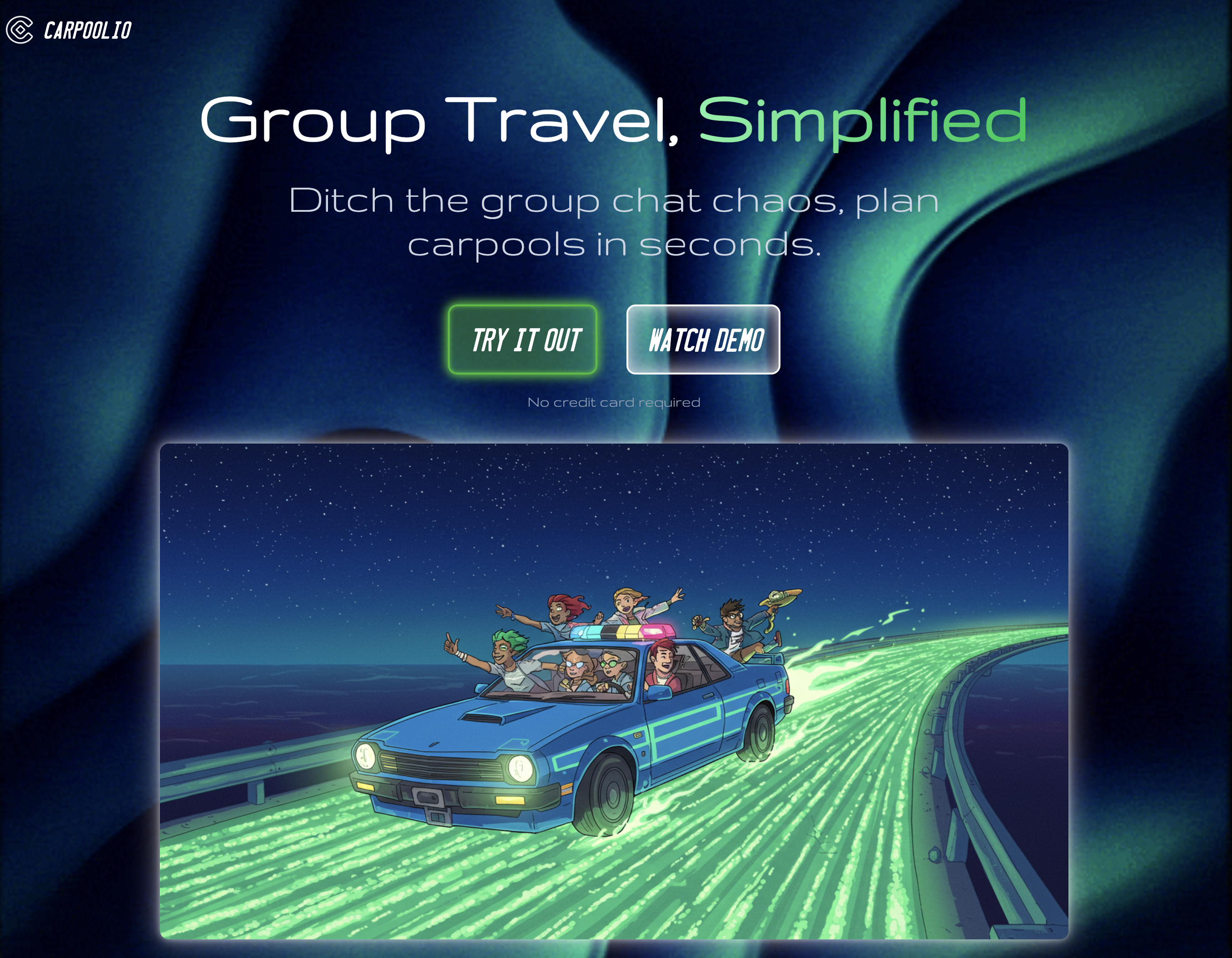
 Carpoolio
Carpoolio’s mark on its landing-page colors
An experience list that says what I did
The idea. The last column says what I did at each place instead of my job title, for example “Ran 500+ research interviews for NIH studies.”
Why. Mitul’s homepage listed what he did at each job, and it carried a career switch into a design engineering role. It’s 1 example, so this is a weaker signal than the others.
How I’ll test it. Ask reviewers what I did before design. If they can name the research, the list is doing its job.
About, rewritten around design
The idea. About connects my research interviews to how I design, instead of opening with my path into software.
Why. No career switcher in the landscape led with their old career. 3 showed it on the homepage, 2 kept it on About, and 1 left it out. Sara got the most from hers by turning it into a niche.
How I’ll test it. Try the psychology and neuroscience background in 3 places: a line on the homepage, About only, or a case study that draws on it. Ask reviewers whether it reads as a strength or a detour.
2025:
My path into software development wasn’t traditional.2026: My path into design wasn’t traditional.
2025:
When I’m not coding I:2026: Outside of design and engineering, I’m:
Every line true
The idea. Every claim traces back to my resume or to work someone can see. I checked every claim on my OrderSync case study against the project and cut 3.
Why. The job posts ask for proof. Shipped work comes up in 27% of portfolio asks and measurable impact in 14%, and a claim nobody can check proves nothing.
How I’ll test it. Ask reviewers which lines they’d want proof for, and make sure each of those links to it.
Cut:
Shared conversion surfaces, instrumented end to end with PostHogThe analytics were real, but they weren’t my work.
Cut:
Zero design debtMy own audit tool found 22 off-palette colors.
Cut:
The audit proves the site follows the systemIt checks the site. “Proves” claimed more than the tool does.
Design system
The prototype so far uses 5 color tokens and 3 typefaces, each with 1 job. The main components are SiteShell, SiteHeader, Tile, HeroHeadline and SideSwitch.
paper
#FAFCFD
#0F172ABackground
ink
#0F172A
#FAFCFDText
Contrast 17.3 / 17.3muted
#66727F
#A7B1BDLabels and metadata
Contrast 4.8 / 8.2line
#E3E8EE
#3D4A5CDividers
blue
#001AFF
#A5B1FFLinks, active nav
Contrast 7.9 / 8.8
Newsreader
Headlines and project titles
I’m Erin, a designer who engineers.
Geist
Body text
My path into design wasn’t traditional.
Geist Mono
Navigation, labels and metadata, a small dose of the old site
Work Fun About
Accessibility so far.
- The switch is announced as a switch (
role="switch") with a label. - Every interactive element has a visible focus ring.
- Motion respects reduced-motion settings.
- Every tile has alt text that describes what’s in it.
Results
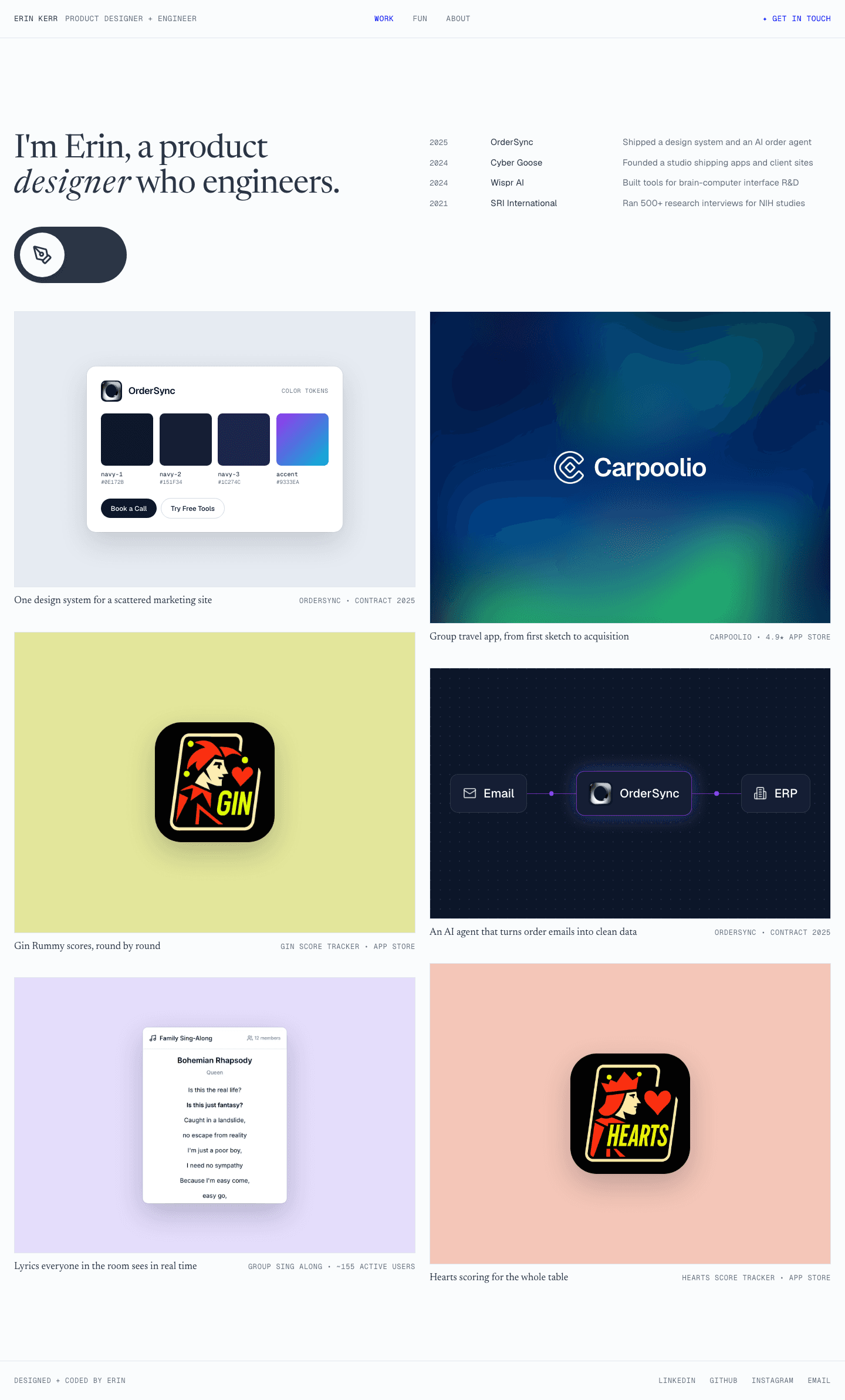
The first screen now leads with design work.
2025
2026
In progress
The final first screen goes here once testing is done.
| 2025 | 2026 | |
|---|---|---|
| Headline | “Designer & Full Stack Developer” | “I’m Erin, a designer who engineers.” |
| First screen | 10 tiles, 1 about work | Headline, experience, then case studies |
| Lead project | Git Racer | OrderSync design system |
| Card labels | Tech stack | App Store rating, active users, client |
| Side projects | Mixed in with client work | Their own page |
| Old site | Overwritten | Archived at /archive/2025 |
In progress: Session results
How many reviewers find a design case study within 20 seconds on the old site and on the new one, what they remember, and the best quotes. Real numbers only.
In progress: After launch
Replies from design roles, and which case studies get opened.
Reflection
Counting changed how I saw the old site. I knew it leaned technical, but 13 mentions of code against 2 of design, and 1 tile in 10 about my work, made it concrete enough to act on.
The job posts changed what I think engineering is for in a portfolio. 88% of them mention prototyping or code somewhere, but only 2% of portfolio asks do. Building is still how I work, so the switch keeps it a click away, but it isn’t the headline anymore.
Next time I’d do the research first. I started building on September 20 and pulled the job posts on October 1. Curation turned out to be the top portfolio ask, and knowing that sooner might have saved me the design page I threw away.
Next: finish the reviewer sessions and write the design side of every case study.